

By Rebecca Pierce, Ball State University, and Matthew Brenneman, Embry Riddle Aeronautical University
The goal of the GAISE: Pre-K–12 Report is statistical literacy for all. But statistical literacy is not achievable unless students understand why they personally need to learn statistics. One could cite high-paying jobs in data science as a motivation, but this pertains to just a minority of students. Even the sea of statistics students encounter daily is created by someone else, requiring little thought on their part about the statistics’ generation, meaning, or interpretation.
However, fake news and COVID-19 are two subjects students will find relevant, concrete, and empowering.
Fake news, a catch-all phrase for misinformation and disinformation in the media, is not new. More than 2,000 years ago, Octavian gained control of Rome by spreading tabloid-like propaganda about Anthony and Cleopatra on coins with short slogans (a sort of ancient form of X, formerly Twitter). Throughout history, those desiring power and wealth have used fake news.
The influence of fake news has changed, however, with the emergence of new media that make it easier to reach larger populations. From newspapers to radio and TV to the internet, it is now possible to share information with practically anyone in the world with just the click of a button. Our students, who use the internet as their primary source of information and are exposed to fake news regularly, understand this topic is relevant to them, as the confusion produced by fake news leads to an erosion of public trust in major institutions and divisiveness that destroys social cohesion.
Presented here is a case study concerning the COVID-19 pandemic that concretely illustrates to students why understanding statistics is important on a personal level. COVID is also used to illustrate the dangers of fake news. Not only did news agencies and tech giants censor stories deemed to be “misinformation” but the US Centers for Disease Control and Prevention withheld vital data from the public and health officials.
Although censorship of the media by large tech giants—a reality today—is one solution, it is at odds with a free and democratic nation and does not address the root cause of the problem. A better solution to combat fake news is producing a new generation of ‘statistical citizens.’ One of the ways we, as statistical educators, can lead the fight against statistical illiteracy is to show students how fake news arises. This case study helps foster habits essential to developing the independent and critical thinking skills necessary for statistical literacy: skepticism, curiosity, and unbiasedness.
A Guided Classroom Discussion
One way to start such a discussion is to show the class the following statement:
A 2021 broadcast of The Highwire reported the mortality rate of those who contracted the delta variant of SARS-CoV-2 was over twice as high for those vaccinated than the unvaccinated.
Before getting into the weeds and to ascertain whether the students understand the claim, a good first question to ask is, “What is this report actually claiming?”
When they recognize a story might be fake news due to the controversial nature of a topic, how do our students evaluate information from news stories on the internet? We can get insight by asking two questions. The first question: “Assume you were not vaccinated when you heard this report. Based on this report, are you more or less likely to get vaccinated?”
Emphasize statistics is, first and foremost, an investigatory process. Revisiting this question at the end of the discussion, students should understand the correct answer is neither “yes” nor “no,” but rather “I can’t say without investigating further.”
The second question: “Why or why not?”
This question sheds light on the student’s critical thinking skills and how they make decisions based on statistical information they hear.
A detailed list of the reasons should be made (to address valid versus invalid reasoning). Hopefully, themes emerge, but you can elicit them using a Socratic-like manner of questioning. No doubt students will wonder on some level whether the study is legitimate, which leads to the question, “Does this result seem reasonable?”
A good habit of mind for a statistically literate student is skepticism. Skepticism requires students to recognize when something sounds strange or counterintuitive. In this case, the fact that the mortality rate is higher among a group we would expect to have more protection should seem odd to them.
At the same time, it is important to emphasize that we do not reject statistics simply because they seem counterintuitive. Skepticism indicates something requires further investigation and is not a filter to dismiss anything we think doesn’t seem right. After all, if statistics just confirmed our beliefs, it would be rather pointless. And although results in statistics generally do seem reasonable, there are important counter-examples—like the placebo effect—that are unexpected yet true. So, while skepticism is important in detecting potential fake news, it must also be tempered by an open mind that considers all reasonable interpretations of the result.
Possible alternative explanations for this result could be the following:
- Adverse effects from the vaccinations known to occur for the COVID-19 vaccine
- Differences in the health care system in England (which is where this data was collected). As we saw in the US, knowledge of the best treatments and access to them certainly affected COVID-19 outcomes for patients.
- Questionable efficacy of the vaccine (developed for the Alpha strain) for the Delta variant
Although students may find these alternative explanations unconvincing, they’ll realize getting to the bottom of a statistical study requires understanding what the study suggested or claimed happened and considering alternative explanations for the results.
Before either accepting or rejecting the claim made, we must look at the data, leading to the question, “What is the basis for this claim?”
Next, show students the data in Table 1.
Table 1: Mortality Data for Individuals Testing Positive for Delta Variant of COVID-19
For Vaccinated Individuals
| Age Group | Delta Cases | Deaths |
|---|---|---|
| < 50 yrs. | 89,807 | 21 |
| ≥ 50 yrs. | 27,307 | 460 |
| Total | 117,114 | 481 |
For Unvaccinated Individuals
| Age Group | Delta Cases | Deaths |
|---|---|---|
| < 50 yrs. | 147,612 | 48 |
| ≥ 50 yrs. | 3,440 | 205 |
| Total | 151,052 | 253 |
It is time to ask the students a too-infrequently asked question: “Is the data good?” This will lead to the question of how we know a data set is “good.” Unlike what most students think, data is not just a bunch of numbers one finds in spreadsheets or online. Data is a collection of recorded observations with context. The source (Public Health of England, a government public health agency), data collection methodology (from other public health agencies), and timeframe (February 1, 2021, to August 2, 2021) suggest the data is reliable and of high quality. For those interested students, the entire report is available.
Knowing the data is good (i.e., valid), students can compute the total mortality rates for both groups. Include the results by adding another column to the original table, as seen in Table 2.
Table 2: Adding the Aggregate Mortality Rates of the Vaccinated and Unvaccinated Groups (Blue)
For Vaccinated Individuals
| Age Group | Delta Cases | Deaths | Mortality Rate (given as % of total) |
|---|---|---|---|
| < 50 yrs. | 89,807 | 21 | |
| ≥ 50 yrs. | 27,307 | 460 | |
| Total | 117,114 | 481 | (481/117,114 )*100% ≈ 0.41% |
For Unvaccinated Individuals
| Age Group | Delta Cases | Deaths | Mortality Rate (given as % of total) |
|---|---|---|---|
| < 50 yrs. | 147,612 | 48 | |
| ≥ 50 yrs. | 3,440 | 205 | |
| Total | 151,052 | 253 | (253/151,052)*100% ≈ 0.17% |
As reported, the mortality rates for the vaccinated are more than twice that of the unvaccinated (0.41/0.17 = 2.4). So, the facts reported are undisputedly correct.
Now is the time to ask students to re-evaluate their original opinion about the report by asking, “Based on the fact that we now know the data is good and the results are as claimed, has anyone changed their mind?”
This brings us back to the skills necessary for statistical literacy: skepticism, curiosity, and unbiasedness. Unraveling this last point is tricky because it involves concepts often challenging to students, such as confounding and Simpson’s Paradox. Rather than going directly into such complicated issues, we propose an indirect route to help students discover this themselves.
So, let’s start with a question that ties into an aspect of fake news with which they are familiar: “How many of you know the saying, ‘correlation does not imply causation?’” A show of hands will probably reveal most students have heard it.
Next, ask the question, “Can anyone give a real-life example in which correlation doesn’t imply causation?”
The responses may be interesting but, in the end, we want to give the students an example in which confounding occurs (like the relationship between ice cream sales and drownings in a northern state such as New York) and ask them what is going on.
Now that students understand there may be other variables related to both the predictor and response variable, it is time to ask, “In this study, vaccination status (i.e., whether a person is vaccinated or not) is one variable associated with vital status (i.e., whether an individual is dead or alive). Is there another variable that might affect both mortality and whether someone is vaccinated?”
If students cannot determine the answer is “age,” hint that this variable is in the data table.
Now ask the students to go back to the original data table and compute the mortality rates for each age group in the vaccinated and unvaccinated individuals and add their new results to Table 2, resulting in Table 3.
Table 3: Adding the Age-Stratified Mortality Rates of the Vaccinated and Unvaccinated Groups (Red)
For Vaccinated Individuals
| Age Group | Delta Cases | Deaths | Mortality Rate (given as % of total) |
|---|---|---|---|
| < 50 yrs. | 89,807 | 21 | (21/89,807)* 100% ≈ 0.02% |
| ≥ 50 yrs. | 27,307 | 460 | (460/27,307)* 100% ≈ 1.68% |
| Total | 117,114 | 481 | (481/117,114 )*100% ≈ 0.41% |
For Unvaccinated Individuals
| Age Group | Delta Cases | Deaths | Mortality Rate (given as % of total) |
|---|---|---|---|
| < 50 yrs. | 147,612 | 48 | (48/147,612)*100% ≈ 0.03% |
| ≥ 50 yrs. | 3,440 | 205 | (205/3,440)* 100% ≈ 5.96% |
| Total | 151,052 | 253 | (253/151,052)*100% ≈ 0.17% |
So the students can more clearly compare the appropriate rates, create a condensed version of the table, resulting in Table 4.
Table 4: Total and Age-Stratified Mortality Rates of the Vaccinated and Unvaccinated Groups
| Age Group | Vaccinated | Unvaccinated | Group with Lower Mortality Rate |
|---|---|---|---|
| < 50 yrs. | 0.02% | 0.03% | Vaccinated |
| ≥ 50 yrs. | 1.68% | 5.96% | Vaccinated |
| Total | 0.41% | 0.17% | Unvaccinated |
Ask the students, “What do we make of the results now? How do we interpret them?”
Students can easily see that just focusing on the age group “50 and Over,” the mortality rates for the vaccinated group are much lower than the unvaccinated group. This result seems more appropriate, since the highest at-risk group was older people.
The results for the group “Under 50” may lead some students to think the data is evidence that the mortality rate for the vaccinated is also lower than the unvaccinated. Point out the percentages shown are for a sample, not the population. Also, if an appropriate statistical analysis were performed (like hypothesis test or confidence interval), no statistically significant difference in the rates would be found.
Learning Outcomes
The outcome of this study has the following three important lessons related to how fake news arises from statistics:
- The conflation of a causal relationship with a statistical relationship. One issue in discussing public health data is misinterpreting statistical relationships (i.e., associations and correlations) as evidence that a causal relationship exists. A discussion can begin with the question, “Now that our analysis of the given data is complete, how do we interpret our results?” The answers will be interesting because some will likely reveal language suggesting a causal relation. Again, the mantra “correlation (or association in this case) does not imply causation” is a good one to remind students that to draw conclusions about causal relationships from associations or correlations alone is not a valid use of statistics. This is an important point to make since it is such an easy trap into which to fall. During the pandemic, even well-educated public figures implied causality with phrases like, “You’ll be less likely to have a particular adverse health event if you get the vaccine.”
- The importance of being unbiased. An unfortunate reality is that a hurdle to overcoming statistical illiteracy is personal bias. Although considering the source of a report is important in determining if it may be biased, it is not a filter used to automatically reject results from the other side of the political fence. The show that made this podcast, The Highwire, does have ties to anti-vaccine groups. However, if the data is legitimate (and it is), then it is essential to investigate the data and draw conclusions before rejecting it. This case study is an excellent example of why this is important, since the correctly interpreted results show neither side is entirely correct. While the mortality rates for the older age group are lower for those vaccinated, there is no statistically significant difference in the mortality rates for the younger age group based on vaccination status. Another benefit of this study is it shows students that, unlike textbook problems in which there is a right and wrong answer, real-world statistics has many grey areas. While unsettling and sometimes difficult for students to accept, it illustrates another reason for not jumping to conclusions based on a blurb from a soundbite.
An interesting exercise would be to see how students’ biases influence their judgments. For example, a variation of this lesson would be to tell students the podcast came from a conservative media personality and the data is legitimate. Then, you would ask, “Do you believe this result?” Play devil’s advocate with students who say the result is unbelievable by pointing out the data and conclusions are undisputedly true. The interesting part would be to see why students continue rejecting the claim. And again, there is no single answer, as a student might suspect the side with a potential bias might be manipulating the data somehow, which is a good form of suspicion and one we want to foster. However, we do not want to throw the baby out with the bath water. Instead, emphasize not rejecting a study based solely on its source without further investigation. - Understanding One Source of Fake News: Simpson’s Paradox. All students are aware that statistics are used to make misleading claims. However, without understanding the misuses of statistics, this awareness can be an example of when too little knowledge is harmful. Students who don’t know what to look for in spotting fake news may reject or ignore all statistics. The origin of the problem in our example, Simpson’s paradox, appears—as its name implies—somewhat contradictory to students when they first encounter it. Most students probably recognize the reversal in the direction of the association upon stratifying the data by age seems weird and even contradictory. We can identify the elephant in the room by asking, “Doesn’t it seem strange that the overall mortality rate for the vaccinated group was higher than the unvaccinated group? But when we considered the age groups, the mortality rate for the vaccinated was less than the unvaccinated for both age groups.”
Helping students understand the origin of Simpson’s paradox can be tricky. In this case, because the rates involved differ by orders of magnitude, graphical illustrations are not useful. However, we can start by drawing attention to the fact that stratifying the data by age group created an unequal distribution of individuals in the two groups. Going back to the data, ask students to create a contingency table by computing the percentage of people in each age group for the vaccinated and unvaccinated individuals, as in Table 5.
Table 5: Distribution of Age Groups for the Vaccinated and Unvaccinated Individuals
| Age Group | Vaccinated | Unvaccinated |
|---|---|---|
| < 50 yrs. | 89,807 (77%) | 147,612 (98%) |
| ≥ 50 yrs. | 27,307 (23%) | 3,440 (2%) |
| Total | 117,114 (100%) | 151,052 (100%) |
It is useful now to stop and make two observations we’ve learned so far from the data.
- Regardless of vaccination status, the mortality rate for the older group is higher.
- The percentage of older people in the vaccinated group (23%) is 10 times larger than for the unvaccinated group (2%).
This leads to the following question to help students understand the basic concept underlying Simpson’s paradox: “Does it seem reasonable that having a higher percentage of individuals in a group with a higher death rate could increase the overall death rate?”
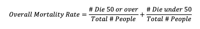
Although this idea seems reasonable, we want to quantitatively examine it to show the apparent contradiction by means of a simple explanation. Start with the definition of the overall mortality rate, which can be expressed as the sum of the mortality rates for each age group (relative to the entire sample):
To express the overall mortality rate (OMR) in terms of the age group mortality rates, we simply multiply and divide each fraction by the number of cases in each age group:
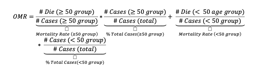
Since the sample sizes are large enough to assume the mortality rates for the age groups are precise, we can use the values from Table 4 to express the overall mortality rates for each group by vaccination status as
OMR vaccinated=1.68*% People 50 or over + 0.02*% People under 50
OMR unvaccinated=5.96*% People 50 or over + 0.03*% People under 50
Since the age groups are complements, it makes sense to introduce new notation and rewrite the equations as
OMR vaccinated=1.68*p+ + 0.02*(1-p+)
OMR unvaccinated=5.96*p– + 0.03*(1-p–)
Where p+ and p– denote the percentage of people 50 or older for the vaccinated and unvaccinated groups. Students now see that the overall mortality rate is not dependent on just the mortality rates for each age group, but also the percentage in each age group.
Now ask students to do the following two computations and determine each time which group has the higher overall mortality rate:
- Compute the overall mortality rates for the vaccinated and unvaccinated if p+=100% for the vaccinated and p–=0% for the unvaccinated.
- Compute the overall mortality rates for the vaccinated and unvaccinated if p+=0% for the vaccinated and p–=100% for the unvaccinated.
From these two simple calculations, the students will see how the age distribution for each group affects the overall mortality rates, even when the mortality rates for both age groups are lower for the vaccinated than unvaccinated groups.
Although a more in-depth discussion of Simpson’s paradox is possible, the two main lessons students should take away from this case study are the following:
- To be aware of other factors that might influence the results (not just the ones given). One of the main ways fake news arises is by selectively choosing the variables that yield results favorable to a certain point of view.
- As a corollary to the previous point, rates that depend on a categorical variable should be interpreted cautiously, since the overall rate is a weighted sum of the rates over each category. This case study shows the distribution of cases among the categories may significantly affect the overall rate.
Putting It All Together
Statistical literacy is an achievable goal. However, to achieve statistical literacy, our students need to realize statistics is something they will use in their life. As educators, we can show students how an understanding of statistics is essential to them personally by presenting real-life examples that are relevant, important, concrete, and empowering.