

By Emily Thrasher, Hollylynne Lee, Bruce Graham, Matthew Grossman, Gemma Mojica, NC State University
This paper explores a comprehensive framework to develop students’ data literacy by guiding them in making sense of complex data visualizations. With the growing complexity and prevalence of data visualizations in media, it’s crucial to equip students with the skills to critically analyze and engage with these visual forms of data. This toolkit emphasizes the importance of fostering data habits of mind, rather than mere computational proficiency, and encourages students to consider what a visualization is conveying, how it was created, and why it was created.
To support classroom discourse on data visualizations, the authors present a discourse framework with three interconnected elements that support student sense-making within the classroom:
- Unpacking Context and History: Encourages students to explore the origins of the data, its creators, intended audience, and the sociopolitical or historical background.
- Reading the Visualization: Entails carefully attending to the visualization’s structures such as scale, axes, and color, as well as understanding what was being measured and any computed statistics being displayed.
- Personalizing the Data: Requires prompting students to think about how they and others may be represented in the data, or if they or others are not being represented.
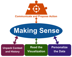
Additionally, once students have made sense of the data visualization, they should be empowered to Communicate and Propose Action on the insights they gained, preparing them for more engaged, data-literate participation in both their personal lives and civic communities.
To facilitate implementation, the paper provides a toolkit with several classroom-ready resources. Guiding questions for each element of the framework are provided, along with an example. Additionally, links to data visualizations ready for classroom use are offered to get you started in your own classroom.