
By Anna Gralnik, Aurelia Pennekamp Elementary School, and Anna Bargagliotti, Loyola Marymount University
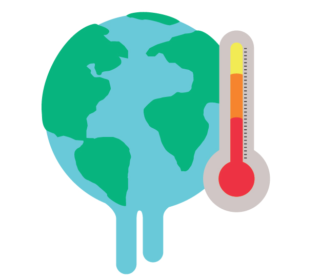
Climate change is one of the most important challenges of our generation. Across the world, extreme weather presents unprecedented structural and economic challenges for humans. Students should be given the space in educational settings to learn about the issues surrounding climate change and reflect on how their communities are contributing and being affected by it.
To do this, Anna Gralnik posed the following investigative question to her 5th grade class: What are typical climate challenges that affect our community?
To investigate this question, the students used multiple data sources, including an interactive map found in The New York Times and data they collected based on the map. The data-driven portion of the investigation, which was aligned with the Guidelines for Assessment and Instruction in Statistics Education II (GAISE II) Report, took several days and was delivered in an online setting due to COVID-19.
It is important to note that the unit on climate change was at the core a writing unit. Information gathered from these centers was used and applied to students’ informational essay writing.
Inquiry Centers
To support students in a cross-curricular investigation, Gralnik set up a series of five “inquiry centers” over a one-week period. Each center included a task card with directions, guided questions, and sentence stems for students to use. As a team, students interpreted, discussed, notated, analyzed, and asked questions.
The objective of an inquiry center is to grow ideas through conversations with peers in which they ask questions; make connections between multimedia nonfiction resources; critically observe, interpret, and question photographs; and analyze and study documents to formulate new ideas. While at an inquiry center, the goal for students was to draw upon what they already knew and formulate new ideas.
Gralnik adapted the inquiry centers for the climate change investigation from a presentation given by Teachers College Reading and Writing Project. The centers were the following:
Photography Inquiry Center—Objective: Critically observe a photograph, ask questions, and interpret ideas.
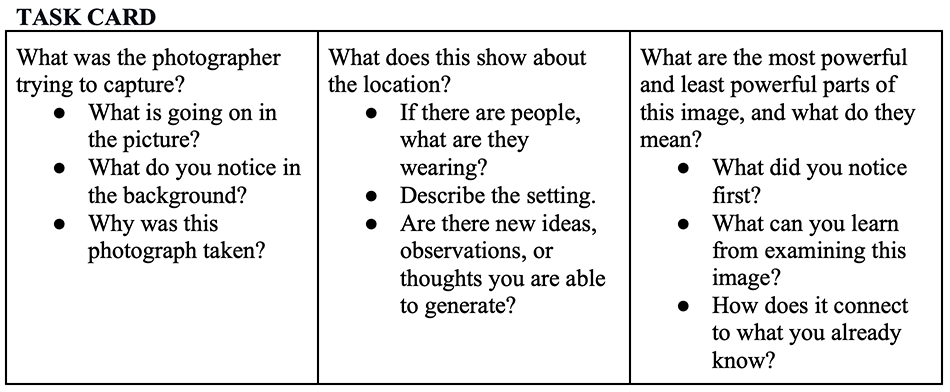
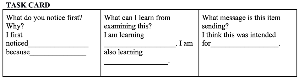
Write Around—Objective: Observe by asking questions and generate ideas and possible responses.
Read and examine information about California’s drought.
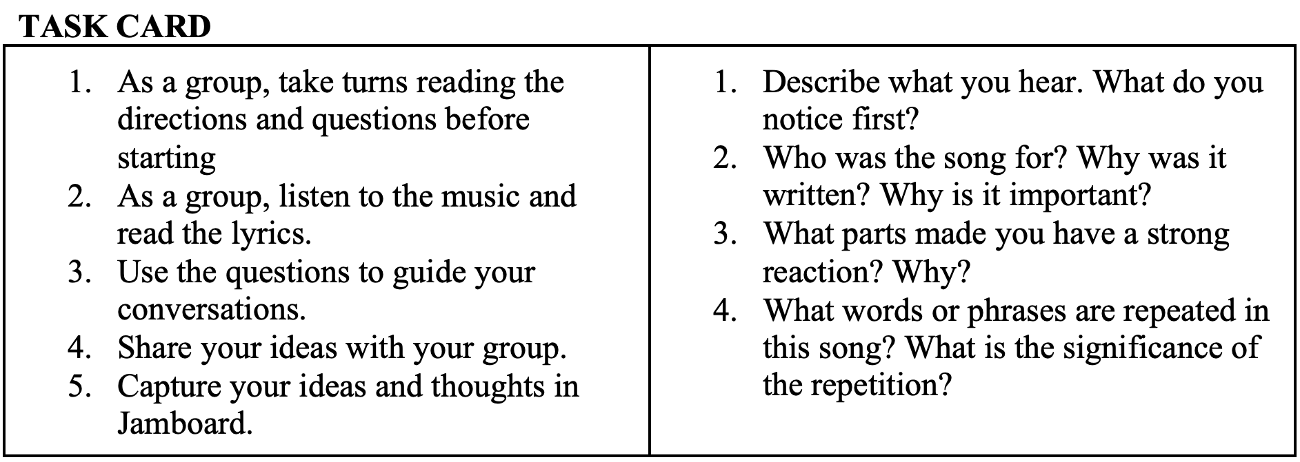
Music—Objective: Listen to music and connect to a time and place where you step into the lives and experiences of others.
Listen to “Mercy Mercy Me” by Marvin Gaye.
Film—Objective: Connect a film to the current social issue.
Watch the film HumanNature.

Data—Objective: Use data to analyze the current social issue.
Three Days of Inquiry Through Data
Day 1. Students participated in a data talk as designed in the What’s Going On in This Graph? collaboration between the ASA and New York Times. Students studied a map focused on climate change and discussed what they observed. To guide their observations, students referred to the following questions while discussing issues related to climate change in breakout groups:
- What do you see in this graph?
- What do you notice?
- What do you wonder?
- What impact does this have on you and your community?
Teachers should expect students to comment on all parts of the United States. They can direct students to think about their notion of community on the macro level of the overall United States and then the micro levels of their state and county. They can also encourage students to focus on their own geographical area, given the investigative question is specifically about their community. Following are student answers for those living in Southern California:
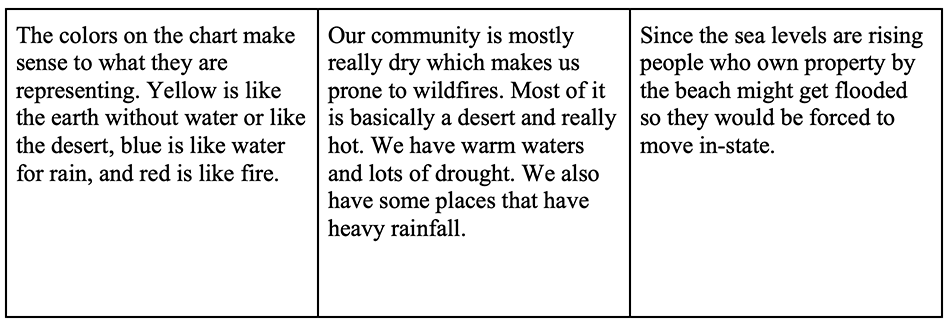
The six distinct colors in the graphic represent a type of environmental risk. The risk variable is categorical with six categories. The categories are: Wildfires; Sea Level Rise; Extreme Drought and Water Stress; Extreme Heat; Extreme Rainfall; and Hurricanes.
Students should notice different areas of the United States are subject to different environmental risks. Large portions of the United States are subject to water stress. Extreme heat is focused mostly in the mid-south and lower Rust Belt. Extreme rainfall is in the northeast, and hurricanes hit the Atlantic coast and eastern southern states. The Pacific west coast has extreme rainfall in the northwest and wildfires.
Day 2. After observing the map statically, students interacted with the map by moving their cursor to their state.
To guide their data investigation with the interactive map, Gralnik posed the following analysis questions:
- What does the color coding represent?
Students should have noticed this on Day 1 while studying the map statically. The environmental risk is a categorical variable with six categories. - What does the darkness/lightness of the color represent?
The gradation of the color represents how severe the risk is. The darker the color, the more risk there is. For example, although both Missouri and Tennessee can experience extreme heat as an environmental risk, Missouri has a higher risk. - Where does the data come from? What data was collected to make this map?
To understand the source, students should go to the original article, which states the data came from a report by Four Twenty Seven, a company that focuses on assessing climate risk on financial markets.
Data has a source, and the source needs to be confirmed by students as reputable. Reputable sources have citations and descriptions of their data collection process and any limitations of the data. Data collection and study design are an advanced and important part of statistics. It is essential that students at an early age develop the practice of checking sources when drawing conclusions or making assertions.
What Are You Noticing Now?
Now that students can interact with the map, they will notice more detailed information is provided—including the specific county—as their cursor hovers over the map. Students can also see that, as they hover over a county, each county is assigned a category for each of the risk types. Using this information, students can make deeper statements in answer to the following:
- Explain what features of the interactive map help you to notice.
- What conclusion can you draw based on your discoveries?
- Continue exploring and noting your discoveries.
Using their answers to the bullet points above, students can begin to combine their observations into more complete and coherent thoughts. For example, one group tried to connect the different risks. By hovering over a county on the map, students can see the county is given a rating of either very high, high, medium, low, or no risk for each of the risks. These ratings are what determine the darkness of the color.
- What are you noticing about your own community?
Student answers will vary to this question. As the investigative question focuses on the students’ local community, they should be encouraged to focus on their area of the map. - What are you noticing about other states?
Student answers will vary for this question. Once students finish interacting with the map, they can draw conclusions and summarize their findings in the greater context of the investigation.
As part of their class, Gralnik’s students read articles discussing climate change, read opinion pieces about climate change, and wrote an essay. Using data, they also created debates between climate change advocates such as Greta Thunberg and anti-climate change advocates such as Naomi Seibt.
Using the data from the graph and the conclusions drawn the day before, students can support their conclusions and focus on communication with data (an important principle of data science and statistics). Here is an example of a student’s summary:
For a while, our class studied a map to tell us all about our country’s problems related to climate. We found a few no risks, which is good. However, if we keep up all the emissions, natural gases, and more, we will most likely get all lows or higher. All of our class observed and wrote down a ton of things that we found about our climate, and I hope you can figure out a way to find your climate’s pros and cons and create ways to help lower the risk of climate change in your community!
Day 3. On the last day of inquiry, students were asked to dive deeper into climate change in their community, not just their region, and create a data set showing the different climate threats and degree of threat. Gralnik assigned each group 10 counties in California (the location of the community in which they were in) and asked them to use the map to collect data on those counties. Table 1 is an example spreadsheet created by students.
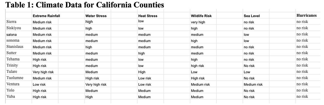
For each county, students recorded the severity of each of the risks. On their own, they then tallied the risks into a table (see Table 2) and made graphical displays such as the bar graph and pie graphs in Figure 1 to help illustrate the risks in their community.


Using these data, students were able to answer the posed investigative question about their community and delve deeper into the data presented in the map.
Conclusion
The goal of this investigation is to use data to deepen ideas and gain insight into climate change. Students analyzed the map of the United States and used multiple perspectives to interpret it. Students were scaffolded to reflect their prior knowledge and connection to new information presented on the map. Throughout the investigation, students developed questions they wanted to investigate based on what they observed. They were no longer merely looking at the United States map but investigating the cause and effect of climate change and asking questions.
This investigation meets curriculum standards in multiple pathways, and existing curriculum from other subjects can be used in collaboration. It is cross-curricular and builds on multiple layers of knowledge such as language of discipline (science), writing (reflections, information text), reading (theme, big ideas, categorizing and classifying information), and statistics and mathematics (patterns and data talks).
This investigation provides opportunities for students to make connections between old and new discoveries. Students can formulate new theories about climate change and defend those theories using evidence presented on the map.