

By Mary Richardson and Daniel Adrian
Students should be exposed to current and interesting data sets. Most, if not all, will have at least some familiarity with The Biggest Loser television show. Portions of the following discussion have been adapted from Wikipedia, visited on July 2, 2016.
The Biggest Loser is an American reality TV show that debuted on NBC on October 19, 2004. The show features obese contestants competing to win a $250,000 cash prize by losing the highest percentage of weight relative to their initial weight. Each season of The Biggest Loser starts with a weigh-in to determine the starting weights of the contestants. The starting weight for each contestant serves as the baseline for determining the overall winner.
The number of contestants on the show varies from one season to another. As of the summer of 2016, there were 17 seasons of The Biggest Loser, featuring more than 270 contestants. There were 12 contestants on the pilot season. Seasons two and three had 14 contestants and, after season three, the number of contestants varied. The highest number of contestants was 25 in season 11. Season 16 featured 18 contestants, and season 17 had 16 contestants.
The contestants are usually grouped into teams. Depending on the season, a team may have worked with a specific personal trainer, or all trainers may have worked with all contestants. The personal trainers are responsible (in conjunction with medical personnel retained by the show) for designing comprehensive workout and nutrition plans and teaching them to the contestants. The contestants are individually responsible for implementing the principles taught. According to a published interview with Jillian Michaels, one of The Biggest Loser personal trainers, contestants on the show exercise for at least four hours a day.
The competition rules vary from season to season. Typically, the team that tallies the lowest overall percentage of weight lost in a week is deemed to be the losing team for that week. The losing team must vote for one member of their team to be eliminated from the competition. Usually, at some point in the competition, the teams are dissolved and everyone competes individually. Each week, the person who has the lowest percentage of weight lost at a weigh-in is the contestant who is eliminated.
The season finale features both the contestants remaining on the show and those sent home early; the latter are brought back for the finale. Those sent home early compete for a smaller “at-home” prize of $100,000, while those still on the show compete for a $250,000 prize and the title of “The Biggest Loser.” (This means all contestants work toward losing weight for the duration of the show, even if they are eliminated earlier in the competition.)
The lengths of the weight loss competitions have varied, but a typical length has been six or seven months from the initial weigh-in to the televised finale.
The Personal Trainers
Over the 17 seasons of The Biggest Loser, there have been nine personal trainers. The initial two trainers who debuted in the pilot episode of the show were Bob Harper (seasons 1 through 17) and Jillian Michaels (seasons 1, 2, 4 through 11, 14, and 15). These two trainers are arguably the most well-known and have come to be associated with the show.
Perhaps the next well-known trainer is Dolvett Quince (seasons 12 through 17). The other six trainers have been Kim Lyons (seasons 3 and 4), Cara Castronuova (Season 11), Brett Hoebel (Season 11), Anna Kournikova (Season 12), Jessie Pavelka (Season 16), and Jennifer Widerstrom (seasons 16 and 17).
Analysis of Data from the Show
Description of the Data
An Excel version of the data file can be downloaded here.
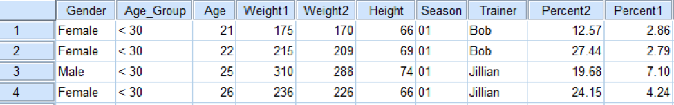
Figure 1 shows a subset of the data file as displayed in SPSS and provides descriptions of the variables. (SPSS is also used to produce all the numerical and graphical summaries in this article.) The data was extracted from Wikipedia on July 2, 2016. This web page provides a detailed description of each of the 17 The Biggest Loser seasons. To obtain data that could be used to demonstrate descriptive statistics and graphs, only portions of the data available on this web page were extracted and input to the data file.
Variables in the Data Set
- Gender: Male, Female
- Age_Group: < 30, 30 to 39, 40 to 49, 50 to 59, 60 Plus
- Age: The contestant’s age in years during the show
- Weight1: The contestant’s starting weight in pounds
- Weight2: The contestant’s weight at the first weigh-in, usually after the first week
- Height: The contestant’s height in inches
- Season: The season of the show the contestant was on
- Trainer: The trainer of the contestant at the time of the first weigh-in
- Percent1: The percentage of weight lost at the first weigh-in
- Percent2: The percentage of weight lost at the finale
*Note: There have been a few contestants who, for various reasons, were not present at the finale. These contestants’ variable values were not included as part of the data set. All contestants to date have participated in the initial weigh-in.
Examining the Number of Pounds Lost During the First Week
Most of us think about number of pounds lost when we are assessing the success of a diet, so a natural starting point in the data analysis might be exploring descriptive calculations for the number of pounds lost during the contestant’s first week on The Biggest Loser. According to the Centers for Disease Control and Prevention, evidence shows people who lose weight gradually and steadily (about one to two pounds per week) are more successful at keeping the weight off. The rate of one to two pounds per week is based on what is deemed a reasonable amount of weight for a typical dieter to lose.
It is well known that The Biggest Loser contestants lose mind-boggling amounts of weight in the initial phases of their exercise and diet routines—far exceeding one to two pounds per week. But how many pounds does a typical The Biggest Loser contestant lose in the first week of the competition?
Table 1. Descriptive Statistics for Pounds Lost During Week One
| N | Mean | S.D. | Min | Q1 | Median | Q3 | Max |
|---|---|---|---|---|---|---|---|
| 277 | 16.83 | 7.04 | 2.00 | 12.00 | 16.00 | 20.50 | 41.00 |
Note: The quartiles given above were calculated by SPSS using what is called a weighted average technique. These values may not be the same as the values given by a TI Calculator or other statistical software. However, any difference would be negligible and the interpretation of the values would be the same.
From the numerical summaries provided in Table 1, we can see that a typical contestant loses 16.83 pounds during the first week (mean). Fifty percent of the 277 contestants (N) have lost 16 or more pounds during their first week (median). And 25% of the contestants have lost 20.50 or more pounds in week 1 (Q3). Astonishingly, the maximum amount of weight lost during the first week has been 41 pounds.
In addition, the histogram in Figure 2 shows that the distribution is right-skewed, meaning the range of the values greater than the median (16 to 41 41 – 16 = 25) is greater than the range of values less than the median (2 to 16 16 – 2 = 14). Because the mean is pulled in the direction of skewness away from the median, the mean is larger than the median.

Leveling the Playing Field: Focusing on Percentage of Weight Loss
Beginning with Season 2, the rules were changed so the weigh-ins were judged based on percentage of weight loss, instead of the number of pounds lost. Percentage of weight loss is calculated as
The reasoning behind this change was the theory that contestants with higher starting weight should be able to lose more weight and would therefore have an unfair advantage if the competition was based solely on number of pounds lost.
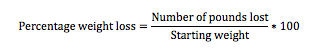
But does the data support this theory? To see, we can look at the relationship between starting weight and number of pounds lost at the finale in a scatterplot, as in Figure 3(a). The scatterplot shows a positive linear relationship between starting weight and number of pounds lost; that is, contestants with a higher starting weight tended to lose more pounds, and contestants with a lower starting weight tended to lose fewer pounds. A numerical summary of this relationship is Pearson’s correlation, which takes the value 0.722. The positive sign of the correlation signifies the positive direction of the linear relationship, and that the correlation (which always takes values between -1 and 1) is relatively close to 1 demonstrates that the linear relationship is fairly strong.
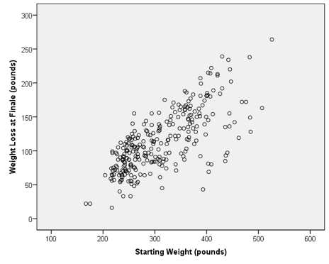
But does focusing on weight loss in terms of percentage, rather than number of pounds, indeed level the playing field? We can address this question with another scatterplot, this time with the variables starting weight versus percentage of weight loss, as in Figure 3(b). This scatterplot shows much less of a relationship between the two variables than Figure 3(a); there are contestants with low and high percentages of weight loss regardless of starting weight. In this case, Pearson’s correlation is 0.217, indicating the relationship of starting weight with percent weight loss is much weaker than the relationship with number of pounds lost because the correlation value is much closer to zero. (Note: It might be argued there still is a positive correlation between percent weight loss and starting weight, albeit a small one. Whether this correlation is “significant” is another matter; this could be determined by a hypothesis test, but we will not perform one here.)
Comparing Weight Loss for Males and Females
Focusing on percent instead of pounds of weight loss also allows for a fairer comparison of the weight loss of male and female contestants. This is because the female contestants tend to have lower starting weights than the male contestants, and therefore tend to lose fewer pounds in the competition, as illustrated by the comparative boxplots in Figure 4a and Figure 4b.
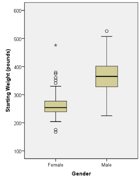
Comparative (also called “side-by-side”) boxplots are useful in making direct comparisons of several aspects of two (or more) distributions. For instance, focusing on the distributions of starting weight for male and female contestants (Figure 4a), we can see the following:
- Male contestants have a higher median (the lines inside the boxes) starting weight than females by roughly 100 pounds
- The starting weight of males varies more than females because the vertical length of the box (the interquartile range, or IQR) is longer
- There are more female contestants who are outliers, and even one who is considered an “extreme” outlier, as shown by the asterisk (We will discuss later how we determine whether contestants are considered outliers.)
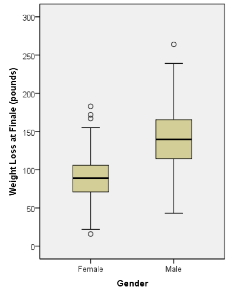
We can similarly compare the weight loss (in pounds) of male and female contestants with the side-by-side boxplots in Figure 4(b).
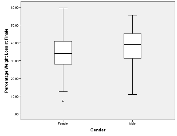
Let’s compare the percentage of weight lost at the finale for males and females. Table 2 contains descriptive statistics, and Figure 5 displays comparative boxplots. As we should expect based on our previous discussion, the distributions of percent are much more similar than those based on raw weight. However, both the mean and median indicate males have a higher typical percentage of weight lost during the competition; male contestants tend to lose about 4–5% more of their initial body weight. The variability in percent of weight loss values is roughly the same for the genders, which can be seen by comparing standard deviations and IQRs, which is computed as Q3 minus Q1.
Table 2. Descriptive Statistics for Percent of Weight Loss at Finale by Gender
| Gender | N | Mean | S.D. | Min | Q1 | Median | Q3 | Max |
|---|---|---|---|---|---|---|---|---|
| Male | 132 | 38.22 | 9.59 | 10.94 | 31.19 | 39.135 | 45.250 | 55.58 |
| Female | 145 | 34.28 | 9.40 | 7.37 | 27.81 | 34.080 | 40.915 | 59.62 |
Examining Rachel Frederickson’s 59.62% Weight Loss: An Outlier?
The Season 15 winner, Rachel Frederickson, had a starting weight of 260 pounds. At the finale, Rachel weighed a shocking 105 pounds, a 59.62% weight loss. Figure 6 shows Rachel at the week 1 weigh-in and at the finale weigh-in.
Due to Frederickson’s gaunt appearance, controversy ensued. There were discussions in the media about whether this weight loss was too extreme and if competing on The Biggest Loser show could be detrimental to some contestants. The following articles discuss this controversy:
- New York Daily News: ‘Biggest Loser’ Sparks Concern Over Winner Rachel Frederickson’s Weight Loss
- People: Past Biggest Loser Winners on Rachel Frederickson: ‘She Wanted to Win’
We can examine whether Rachel’s weight loss is extreme from a statistical point of view by calculating whether her percentage weight loss at the finale is an outlier, which refers to an observation that falls well above or below the overall bulk of the data. By a common criterion, observations are considered outliers if they are more than 1.5 times the IQR above Q3 or more than 1.5 times the IQR below Q1. (We are interested in the former in this case). Table 3 shows the quartiles and other descriptive statistics for the distribution of the finale weight loss percentages.
Table 3. Descriptive Statistics for Percentage of Weight Lost at Finale
| N | Mean | S.D. | Min | Q1 | Median | Q3 | Max |
|---|---|---|---|---|---|---|---|
| 277 | 36.16 | 9.68 | 7.37 | 29.275 | 36.18 | 44.04 | 59.62 |
From the descriptive statistics, we can see that a typical contestant loses about 36% of his or her initial body weight by the time of the finale. Rachel’s 59.62% (which we can see is the record for the show) is well above 36%, but is it considered an outlier relative to the complete distribution of weight loss percentages?
We first calculate the IQR= 44.04 – 29.275 = 14.765.
The threshold is then Q3 + 1.5 x IQR = 44.04 + 1.5 (14.765) = 66.19%.
Because Rachel’s weight loss percentage is not above this threshold, it is therefore not a statistical outlier.
In the previous section, we saw that the typical weight loss percentage values for male contestants are higher than for female contestants. So we might also ask: “Is Rachel’s finale weight loss percentage extreme relative to the females only?” An examination of the comparative boxplots presented in Figure 5 shows that Rachel’s percentage of weight lost is also not an outlier in this sense (because there are no points above the upper whisker of the female boxplot). So from the statistical perspective of outliers being considered extreme data values, the percentage of weight lost by Rachel is not considered extreme.
Of course, in any practical sense, losing 60% of one’s weight (in a six-month period, no less) is certainly extreme. Her weight loss would very likely be an outlier if it were compared to people who were not contestants on The Biggest Loser. The fact that she is not an outlier according to this analysis says more about the extreme nature of the show than Rachel’s particular case.
Body Mass Index (BMI)
The gender difference in starting weights is largely due to a variable we have not discussed yet. Look at the list of variables in Figure 1 and see if you can identify the variable we are thinking of. That’s right! It’s height! See if you can follow our logic:
- Female contestants tend to be shorter than men (see Figure 7a)
- Taller contestants tend to weigh more (see Figure 7b)
- Therefore, women contestants tend to weigh less than men (see Figure 4a)
Height may therefore be considered a lurking or confounding variable in this case because, by being related to both variables of interest (gender and weight), it causes a relationship between gender and weight. However, as you may guess from the names “lurking” and “confounding,” such variables are often more difficult to identify and/or deal with than height in this case.
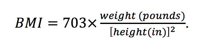
A common way of correcting for height when considering a person’s weight is through the body mass index, or BMI. It is defined as weight in kilograms divided by height in meters squared, or in terms of pounds and inches,
This measurement is commonly used to classify people into weight categories, according to the ranges given in Table 4, which were published by the World Health Organization in 2000 (Obesity: Preventing and Managing the Global Epidemic: Report of a WHO Consultation)
According to data from the National Health and Nutrition Examination Survey, 2009–2010:
- More than 2 in 3 adults are overweight or obese (BMI > 25)
- More than 1 in 3 adults are obese (BMI > 30)
- More than 1 in 20 adults have extreme obesity (BMI > 40)
This is, of course, why the show has been so popular: So many Americans struggle with their weight and can relate to the contestants on the show.
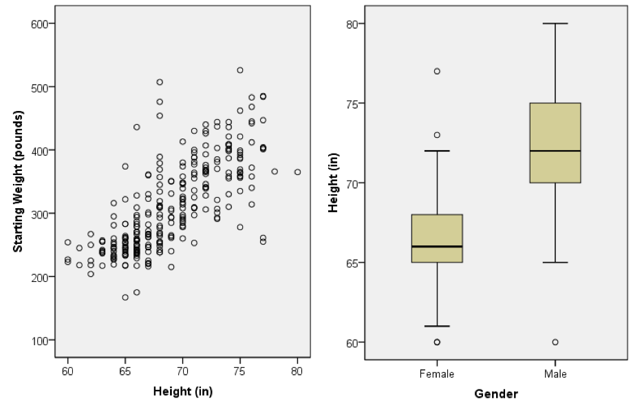
Table 4. Weight Categories According to BMI
| BMI | Weight Category |
|---|---|
| < 18.5 – 24.9 | Normal weight |
| 25.0 – 29.9 | Overweight |
| 30.0 – 34.9 | Class I Obesity |
| 35.0 – 39.9 | Class II Obesity |
| 40.0 – 49.9 | Class III Obesity |
| 50.0 – 59.9 | Class IV Obesity |
| 60.0 | Class V Obesity |
The clustered bar chart in Figure 8 and corresponding Table 5 display the frequency (or count) of the different weight categories of contestants at the first weigh-in and the finale. The difference in the distributions reflects the dramatic transformation that contestants experience during the half-year. At the first weigh-in, the vast majority (216/277 = 78%) of contestants are extremely obese, defined as BMI > 40 (Class III or higher). At the finale, a healthy majority (180/277 = 65%) are below the Class I Obesity category, and 65/277 = 23% are at a normal weight.
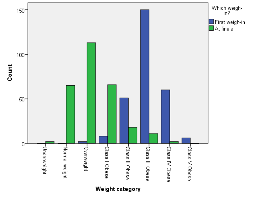

A couple points of interest: First, the only two contestants not in the obese category at the initial weigh-in were part of the first season. After the popularity of the first season, it seems the producers aimed for more dramatic weight loss in subsequent seasons (more on this later). Second, of the two contestants to end the show in the underweight category, one was Rachel Frederickson, whom we discussed earlier. So she is something of an extreme case in that sense. However, her final BMI of 18.0 is close to the border of the underweight and normal categories (18.5).
As discussed earlier, though the contestants of The Biggest Loser undergo a dramatic, life-changing transformation in a short time, such extreme weight loss is not necessarily healthy. A New York Times article highlighted the results of a study that tracked Season 8 participants over the next six years. Thirteen of 14 contestants participating in the study regained some of the weight lost during the show. In fact, the average weight gain was 90 pounds! The study found that the metabolic rate of many of the contestants was permanently slowed as a result of the dramatic weight loss, and this made it extremely difficult for former contestants to maintain the weight they had achieved at the finale of the show.
Comparing the Performance of the Trainers
Over the 17 seasons of The Biggest Loser, there have been nine personal trainers. Each has had his or her personal philosophy of exercising and a unique approach to motivating the contestants to put forth maximum effort in their daily workouts. A natural question is then: Is trainer effectiveness the same, or are there trainers who are more effective in helping the contestants lose weight?
To assess trainer effectiveness fairly, we look at the percentage of weight loss between the initial weigh-in and next weigh-in (which we’ll call week one percentage of weight loss). This is due to contestants frequently training with different trainers over the course of one season. Additionally, eliminated contestants train by themselves at home. By focusing only on the percentage of weight lost during the first week, we can associate each contestant with a single trainer (except for the cases when trainers paired up, which we treat as a separate different trainer). Table 6 gives the number of contestants for each trainer and Figure 9 displays comparative boxplots of the week one percentage of weight loss for the contestants by trainer.
Table 6. Number of Contestants for Each of the Trainers (or Pairings of Trainers)
| Trainer | Anna | Bob | Bob & Jillian | Brett & Cara | Dolvett | Jennifer | Jessie | Jillian | Kim |
|---|---|---|---|---|---|---|---|---|---|
| N | 5 | 79 | 62 | 9 | 36 | 14 | 6 | 54 | 12 |
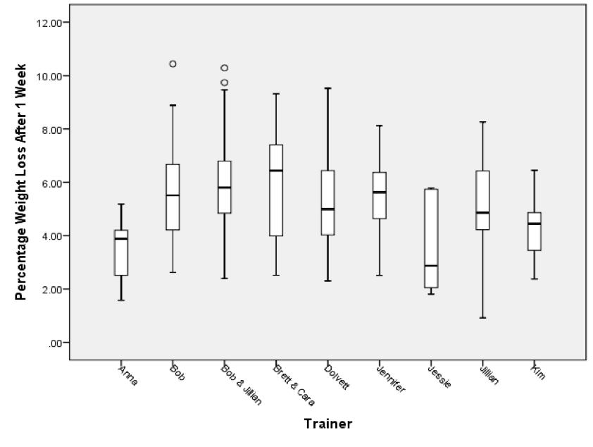
If we examine Figure 9, we can see the contestants trained by Anna, Jessie, and Kim typically achieved the lowest weight loss percentages during the first week (focusing on the medians of the boxplots). Out of these three trainers, the contestants trained by Jessie have the lowest median percentage of weight loss. However, we also note that Jessie’s contestant’s weight loss percentages have large variation (as measured by the height of the box, or IQR) and some of her contestants achieved a more desirable percentage.
Overall, it seems the percentage weight loss of contestants is related to the experience of their trainer. Anna, Jessie, and Kim have trained a tiny number of contestants as compared to Bob, Jillian, and Dolvett (see Table 6), and contestants of the former trainers tend to lose a smaller weight percentage than contestants of the latter trainers. Jennifer is an exception, however. Her number of contestants is relatively small, but her contestants’ distribution is more similar to those who have more experienced trainers.
Experience also does not seem to matter when the trainers are paired. Although Brett and Cara have only jointly trained nine contestants, whereas 62 contestants have been jointly trained by Bob and Jillian, the weight loss percentage distributions for both trainer pairs are similar.
Examining the Relationship Between the Percent of Weight Loss at Week One and the Finale
We may wish to determine if there is a correlation between the percentage of weight lost after one week and the percentage of weight lost at the finale. Figure 10 displays a scatterplot for these two variables.

The scatterplot shows a positive linear relationship between percentage of weight loss after one week and the percentage of weight loss at the finale; that is, contestants with a higher percentage of weight loss during week one tended to have a higher percentage of weight loss at the finale and contestants with a low week one percentage tended to have a low percentage at the finale. For these variables, Pearson’s correlation is .401.
Comparing the Finale Weight Loss Percentages for the Seasons
It is interesting to compare the finale weight loss percentages over the seasons. Figure 11 displays comparative boxplots for the finale weight loss percentages.
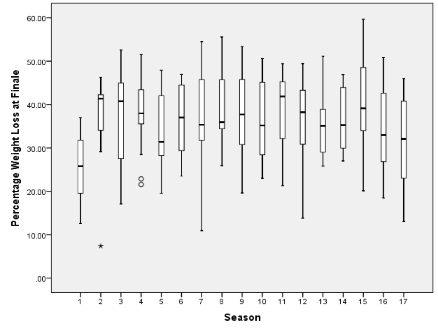
One notable feature is that the median percentage weight loss for Season 1 is considerably lower than the median percentage weight loss for every other season. It is possible that after this pilot season received good ratings, the producers decided to make the weight loss more extreme in subsequent seasons to maintain interest in the show. Recall from the section on BMI that Season 1 was the only time contestants were on the show who were initially non-obese.
It is also interesting to note that the outlier in Season 2 corresponds to a contestant who was eliminated in the second week of the show. Perhaps the show provided more support for contestants competing for the at-home prize following that season, as no other contestants lost less than 10% of their initial weight.
Comparing Weight Loss for Different Age Groups
According to the Mayo Clinic, the amount of muscle you have tends to decrease as you get older and fat accounts for more of your weight. This slows down the calorie burning process and it takes longer to lose weight.
To determine if the older contestants on The Biggest Loser have lost less weight as compared to the younger contestants, a variable called Age_Group was created in the data file. This categorical variable classifies the contestants into five age categories: < 30, 30 to 39, 40 to 49, 50 to 59, and 60 Plus. Figure 12 displays comparative boxplots for the finale weight loss percentages for these groups.
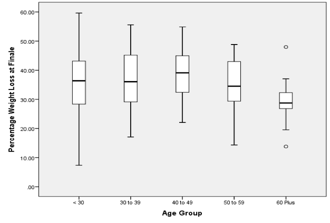
By examining the comparative boxplots for these distributions, it can be seen that the first four age groups have comparable distributions. Interestingly, the 40–49-year-old age group has the highest median weight loss percentage and also less variability in the percentages than the first two age groups. Clearly, the 60 Plus age group tends to have the lowest percentages of weight loss at the finale. With the exception of one outlier, these percentages would roughly be considered in the lower half of the distributions of the other age groups. However, the 60 Plus age group still has a median of roughly 30%, showing it is possible for people at an advanced age to lose large amounts of weight.
Conclusions
The Biggest Loser data set is rich. Because most students have seen the TV show or are at least familiar with its premise, performing an analysis on this data set can be engaging at multiple levels.
The instructor can complete and discuss some or all of the above analyses in their introductory statistics course. Portions of this analysis can be used at the middle- and high-school levels as well. The instructor can formulate questions and ask students to determine what kinds of graphical and numerical measures can be used to assist in answering the questions. The instructor can also present the data and encourage students to formulate their own questions about The Biggest Loser contestants and their weight loss that can be answered through basic analyses of the data.
Our recommendation is the last use. The analysis we have presented here is exploratory in nature, as the title of this article suggests. Because the tools of descriptive statistics are not difficult conceptually, but the difficulty lies in their proper application, asking students to perform exploratory analysis can be time well spent.
To summarize, statistical concepts/tools that can be introduced/applied by this data set include comparative boxplots, outliers, scatterplots, confounding or lurking variables, clustered bar graphs, and numerical summaries such the five-number summary, mean, standard deviation, correlation, and the least-squares regression line.
Though we have only presented descriptive analyses here, this data set can be used to motivate the need for inferential analysis or to introduce inferential techniques on the introductory statistics level.
Further Reading
Fothergill, E., J. Guo, L. Howard, J.C. Kerns, N.D. Knuth, R. Brychta, K.Y. Chen, M.C. Skarulis, M. Walter, P.J. Walter, and K.D. Hall. 2016. Persistent metabolic adaptation 6 years after ‘The Biggest Loser’ competition. Obesity Biology and Integrated Physiology, 00:1–8.
About the Authors: Mary Richardson and Daniel Adrian work at Grand Valley State University.