
By Sandra Madden, University of Massachusetts – Amherst
Have you ever gone looking for a highly productive and foolproof statistical reasoning task? In 2006, I designed a statistical sampling task for use in a professional development project. The intention was to showcase important statistical ideas, encourage conjecture and statistical argument, and illustrate the complexity and promise of seemingly simple tasks to generate productive discourse and expand understanding of statistical ideas.
Since then, I have implemented this task with a range of learners—from those with no prior statistical training to those with advanced statistics degrees. I share the Sampling Bag Task here and include aspects of the task as enacted in various contexts to illustrate the spectrum of reactions with learners.
The Sampling Bag Task (see Figure 1) was designed for a group of 70 middle- and high-school teachers and district administrators gathered for a new multi-year project. Intentional design characteristics included the following:
- Accessibility to a wide range of participants
- A context potentially interesting to educators
- High cognitive demand due to reasoning in the presence of uncertainty
- Introduction to norms of group participation
- A task not typical of secondary mathematics teaching in the US
These conditions are broadly applicable to many school settings. I’ve since used this task with groups as small as 10.
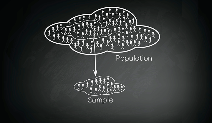
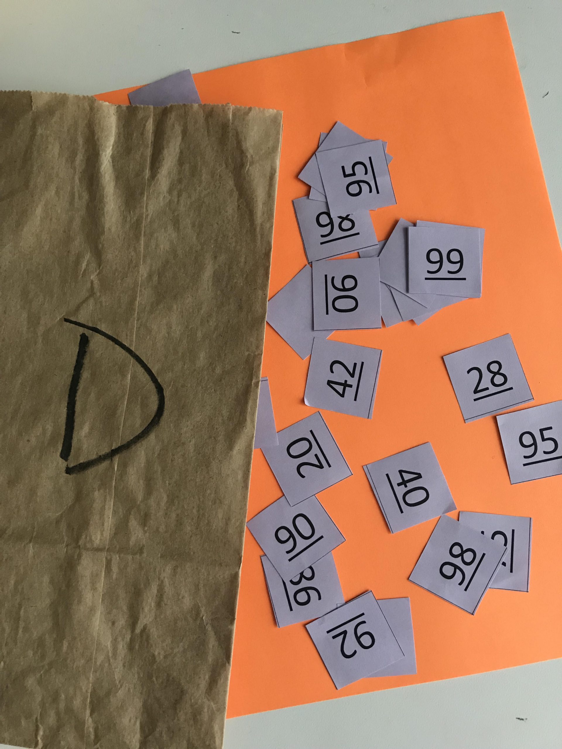
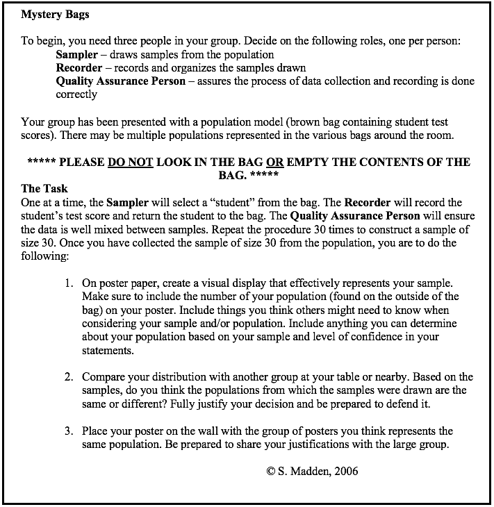
To implement this task, groups of three—each with assigned group roles (in settings with fewer participants, the recorder and quality assurance roles are sometimes combined to have more small groups)—are provided a numbered (or lettered) paper bag filled with small slips of paper (see Figure 1). Each slip in the bag represents a test score from a (fictional) population of school data, and each bag represents a model of a school population.
To clarify, a model of a population is different from a population. For example, if one thinks of a fair die, the die can serve as a model of a uniform 1–6 distribution. To sample from a uniform 1–6 population, a physical model could include rolling a die or having a bag with six slips of paper labeled 1–6 included. It could also be a bag with 12 slips of paper with two each of 1–6 included, and so on.
During the Sampling Bag Task, it was made clear that the bag represented a population model like the die, so we would be sampling with replacement to maintain the relative probabilities of different events occurring when sampling from it. No information about the size of the population or model was provided. Looking in the bag was prohibited.
You may notice that the numbers on the slips are underlined. It is difficult to differentiate 86 from 98 or 66 from 99 on slips of paper. To read the numbers as intended, the underlining determines the bottom and hence the orientation of the numbers. Be sure to retain the codes that match the bag number to the population it contains so revealing the “answers” is done readily. (Note: Even when I have messed this up, chance hasn’t let me down!)
Prior to implementing the task, agreed upon, non-negotiable shared social norms must be established that include careful listening, equitable airtime, a non-evaluative stance, and supporting statements with evidence. These norms are necessary to establish for high-quality sharing and discourse to occur.
During the task (see Figure 2), learners are instructed to 1) draw a random sample of size 30 with replacement from their bag; 2) make some representation of their data on poster paper (do not direct this in any way); and 3) record anything about the actual population they felt confident in concluding from the sample. Once all groups complete this aspect of the task and display their posters, they are asked to consider whether they believe all the posters around the room could have come from identical population models. In accordance with pre-established norms, they are asked to defend their claims with evidence.
I designed this task with five population models and then, from those, constructed sampling bags with sets of each distribution so there was enough variation in the group to be interesting. The setup involves some time and either scissors or a paper cutter, but the bags can be used many times over. At least three or four distributions should be used at a time in a particular setting. Also, the context of “test scores” was relevant for teachers and other educators, but a different context may be useful for middle- or high-school students.
Making Decisions in the Presence of Uncertainty
As Figure 3 illustrates, group posters will vary with respect to how data is represented and the extent to which various claims are asserted. Many groups will make dot plots (sometimes called line plots) and box plots, often with varying scales, making comparisons challenging. Some groups will attend to summary statistics such as mean, median, and mode. Some will include range, IQR, and even standard deviation without prompting. Depending on the background of the learners, representations may vary quite a bit. Sometimes, groups are advised to send out a scout to see what other groups are doing if they are having trouble getting started.

Different Ways to Implement the Task
Version 1—The basic task. I have implemented the task, as designed, with large groups of learners with the goal of invoking productive statistical discussion about results from sampling as applied to comparing distributions. In this case, I ask groups to display their posters and examine them to determine whether their population model might have been the same as any other group’s. They do not know how many population models are possible (i.e., how many populations we started with).
As group members survey the evidence, review many representations of data from posters around the room, and consider the situation, conjectures always bubble up: “Ours is really different than that one.” “Theirs looks pretty similar to ours.” “I’ve never seen a representation like that before.” As a facilitator, I will ask (or better yet, another person will ask) something like, “What do you mean by that?” “What are you looking at to make that claim?” “Does anyone else see things differently or similarly?” Groups might raise issues with differences in the scales or representations people constructed, react to some groups’ computing summary statistics, and question what things on various posters mean.
After sufficient processing, I ask groups to consider their population model in relation to others in the room and, if they think theirs matches another group’s, to take their poster to the vicinity of the match and hang them together. This usually results in temporary chaos while groups scurry to make comparisons and take a public risk. Then, I ask everyone to look around and see how many clusters have been created and whether people agree or disagree with the new arrangement. Sometimes, groups revise their placement(s) based on public feedback. Ultimately, group members give reasons for why they think what they think.
Once consensus emerges, I ask, “Could all of your population models be identical? That is, could each of your bags contain the same population?” Inevitably, more than a few people will suggest it is quite possible to have gotten the results we did if we all sampled from the sample population model. From a prior research study, here is an example of this kind of response:
The distributions of the data from the posters are skewed differently.
Similarities in the Means
In some of the populations, we have the following:
(in populations 2,4, 6, and 30 roughly with the same means from 67 to 71)
(in populations 4, 5, 6, and 30, we see bimodal distributions)
the data is clustered in populations 2, 4, 6, and 30 and spread out more in 5.
Differences in the Medians
In some of the populations, we have the following:
(in population 71.5, 80, and 91.5)
Even though the distributions are different, I think the populations came from the same sample.
The physical sampling context appeared to interfere with some learners’ propensity to accept a sample as anything more than wild random variation—at least at first:
I think the samples came from the same data population. I notice that in all the experiments of picking the samples, there are numbers from 30 to 100. In one experiment, there is one number under 40. From this, I hypothesize that the numbers within the population are spread and there are numbers 30–100. I think there may be fewer numbers in the 30s, a little more in the 40s, and so on and so forth until the 90s and 100. Although the data varies and some experiments show there are more numbers in the 60s then 90s and vice versa, I believe this probably has to do with human error with picking the numbers from the paper bag. Shaking a bag does not do much to the tiny pieces of flat paper with no weight within the bag. I think once put in the bag, the number slips that were on top relatively stayed toward the top and not much mixing occurred within the paper bag. I think this led to some discrepancy between the experiments, therefore causing some people to think that the data is from different populations.
What responses like these typically mean is that participants’ level of confidence and trust in a random sample of size 30 are quite low. They expect random variation in the samples, so any result is fair game. In every implementation of this task, there have been individuals who claim a single population could have generated the variety of samples. When asked how many populations may be represented, if more than 1, answers have ranged from 2 to 7. Once the conversations settle and claims are heard, the actual possible population models are displayed. Usually, there is a burst of groups identifying which model they had in their bag and confidence in their samples seems to soar. Eventually, matches between bag number and population model are revealed and a discussion ensues about what a random sample of size 30 may illuminate.
One particularly noteworthy event happened during my first implementation of this task, and similar events have occurred over the years. While groups were reviewing other groups’ posters, there was a breach of the norm of “non-evaluative stance” when someone critiqued a group’s poster and said their graph was not allowed for this kind of data. The group made a graph similar to that in Figure 4A. Their representation was a sort of time plot with draw number as the independent value and score as dependent.
Serendipitously, the group had aligned itself with another group that had a representation like that in Figure 4C. It turned out to be interesting to all that a seemingly “incorrect” graph could illuminate the underlying bimodal structure of the data. Those in the group that created the graph commented that they could see the separation between the two distinct clusters of data through the horizontal gap that filled the middle of the graph. There were data values toward the top and data values toward the bottom and none in the middle. The group added the mean to their graph, similar to that in Figure 4B.
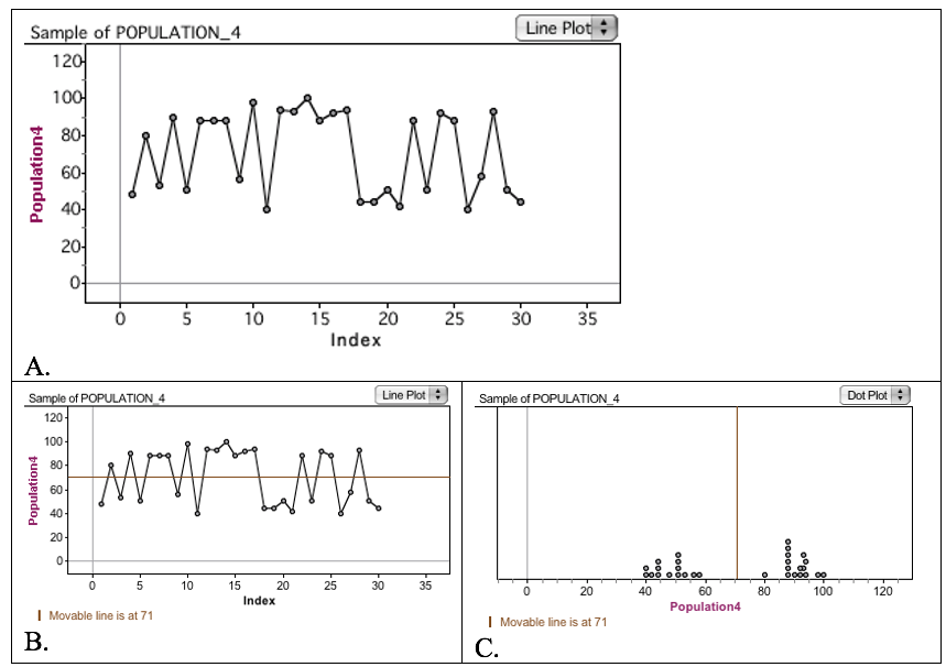
Ultimately, the group that created the “wrong” representation may have felt attacked and vulnerable, but their representation was actually heralded as somewhat unconventional for the situation and ended up being quite useful, especially because the group could reason appropriately with it. This brief event helped dispel the idea that rigid ways of representing data (e.g., dot plots, line plots, box plots, histograms) are always necessary.
Version 2A—Introducing dynamic statistical tools for comparing representations. During events that may span multiple days (e.g., courses, summer institutes), I often use this task as described above but deviate before revealing the population models. In this case, I want to introduce learners to some kind of technological tools (e.g., Fathom, TinkerPlots, CODAP) in addition to making statistical arguments and decisions in the presence of uncertainty. This is an intentional decision to simultaneously build learners’ capacities to use powerful statistical tools.
Because scales and representations vary widely by group, learners often request raw data from each group to make their representations of choice with the same scales for better comparison. One person submitted the following reflection that captures a version of how this modification to the task affected her thinking:
After the class completed the activity last Thursday evening, the data represented on the sampling posters was presented in different ways; there were bar graphs, line plots, box plots. As I began to review the graphed data from each of the five posters, it was kind of confusing to me. I know some of my classmates can pick up the little details from the different graphs, but I couldn’t see it clearly. As I prepared to complete this week’s assignment, I sat in front of my computer and began reviewing the data again. After a few minutes, I wondered what the data would look like if the five samples were presented in the same manner. In my mind, it only made sense. To compare and/or contrast my observations, shouldn’t the data from each population be represented using the same structure? This seemed like a feasible plan and so I continued.
Since I am [a] novice, I decided I would construct a simple line plot for each population. The range for each line plot would be 30 to 100 and it would be divided into intervals of 10 units (points). All the scores that corresponded to their respective tens unit would be represented as “dots” above the appropriate interval. Once I had my five line plots in front of me, I would then proceed to make my observations.
Maintaining the order as posted online, my first line plot represented population #4. What I noticed was there appeared to be a somewhat uniform looking graph. The number of dots for each interval ranged from 7 to 3. There were no drastic peaks or valleys in this plot.
My next line plot was population #3. In this plot, the data appeared to be skewed left. There was a relatively large peak on the right side of the plot. The number of dots for each interval ranged from 1 to 20. There were four dots above 40; one dot each above 50, 60, 70; two dots above 80; and then there were 20 dots above the 90-point mark, creating this large peak.
Population #1 was my next line plot. This plot exhibited two “bumps” in the data. There were eleven dot plots above 50 and 6 dot plots above 90, creating two high points on the line plot. Here, the data definitely looked bimodal.
My fourth line plot was population #5. The data on this line plot looked like the classic, normal curve. There were 12 dot plots above the 70-point mark while only 7 and 6 above the 60- and 80-point marks, respectively, thus creating a graceful curve.
My final line plot represented population #2. Upon completion of this line plot, I observed three bumps in the data. (Does a tri-modal representation exist?) The number of dot plots ranged from 2 to 8. There were 8, 7, and 6 dot plots above 50, 70, and 90, respectively, creating the three bumps in the graph.
In conclusion, since none of my line plots shared the same characteristics, I believe the data originated from five different parent populations.
This person very methodically and sensibly examined the data from each group. She relied heavily on the shape of the plots she constructed and shared her thinking.
A person from another implementation of the task submitted Fathom-constructed box plots and dot plots with her analysis using data extracted from some of her peers’ posters (see Figure 5).
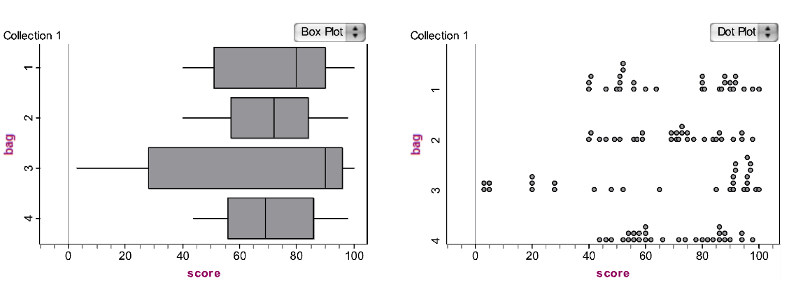
Part of her reasoning is below:
I found it difficult to compare the distributions because they were graphed differently using different scales. I was able to extract the values and graph them on the same set of axes, which makes the comparisons a little easier. From examining the graphs, I believe Bag 3 comes from a different population than the others. This is because it has the largest range of values and appears right skewed. Almost 1/3 of its values are below those of the other bags, and its median value is above the third quartile compared to the other four distributions. When comparing the distributions of the remaining bags, I could either argue that there are two different populations being sampled from or that all three of the bags come from the same populations. Two of the bags (1 and 4) appear to have bimodal distributions while the other bag (2) appears to have values evenly spread out on the interval. However, given that the sample sizes in each case is only 30, it could be argued that this is due to chance and that the data from these three bags (1, 2, and 4) come from the same population. The range of values for each of these four is approximately the same.
This particular person, with a master’s degree in statistics, constructed a slightly more sophisticated response, yet she used language of “right skewed” when the distribution was actually “left skewed.” She appeared skeptical about the sample size of “only 30” and did not use tools from her training (e.g., standard deviation) that might have affected her thinking. Her response sheds light on just how provocative a task like this can be for a wide range of learners.
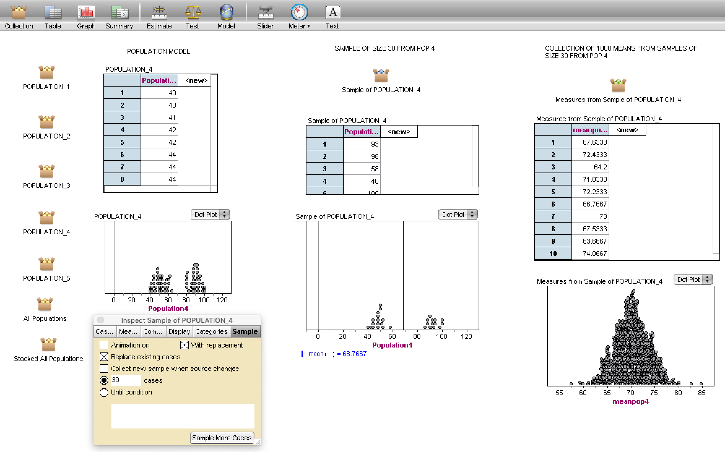
Version 2B—Using technology to explore sampling variability. In the recent past, I have followed the 2A plan and asked participants to refine their conjectures after exploring collective data on the same scales using technology. Participants often ask if they can take another sample of size 30 to see how the samples vary. Rather than doing this by hand, I introduce them to sampling with TinkerPlots or Fathom. I provide them a file with the population models already loaded and then illustrate sampling with replacement. They build up the mechanism for doing so and explore samples of size 30 from the various population models (see middle column in Figure 6).
Some people want to keep track of a particular statistic from their sample, the mean for example. Tools like Fathom easily collect those measures from repeated samples (see right-hand column in Figure 6) and, long before a formal discussion of sampling distributions, learners are constructing empirical sampling distributions for a variety of statistics. Learners can get quite creative in their investigations once they learn how to navigate with tools and they focus on looking for patterns of behavior rather than computational answers.
This sampling bag task—regardless of version 1, 2A, or 2B—supports informal inferential reasoning (IIR). It was designed to incorporate the recommendation that learners have experiences of physically drawing samples and then use technology to investigate sample behavior compared to population behavior. Reasoning involving chance variation and simulation for conjecturing about significant differences is also an aspect of IIR.
Take-Aways
According to the National Council of Teachers of Mathematics (NCTM), students in grades 9–12 should be provided opportunities to learn about data analysis and probability. Students in high school should be formulating statistical questions, collecting data, analyzing data, and interpreting results. In the US, according to Common Core State Standards, 7th-graders (approximately 12–13 years of age) are expected to use random sampling to draw inferences about a population and draw informal comparative inferences about two populations. This is the time when students in the US are introduced to random sampling as a mechanism for producing representative samples from which to make valid inferences.
It has become clear that the Sample Bag Task has provoked learners to amend their beliefs about how samples and sampling provide signals useful for making informal inferences about underlying populations and comparisons among distributions. In particular, learners identified shape, center, and spread as all providing characteristic signatures if the sample was big enough long before any measures were formally investigated. They also began to be more critical of various representations:
I have been very cautious in my examinations of these distributions. I have also begun to distrust the box-and-whisker diagram, which looks very similar for some of them (#2 and #4, for example), though their distributions strike me as fairly different. I’m certainly reasoning and sense-making!
Even though this task uses sampling with replacement, arguments about the size of the sample relative to the population frequently emerge. Technology simulations help remedy that conception. Similarly, the idea that sampling done by hand (e.g., using slips of paper in paper bags) may not represent a good sampling procedure was largely dispelled once the technology exploration and population reveals occurred (although some issues with sampling by hand may be possible).
Following this task, learners were asked to consider what they learned using written reflections. Here is a representative response from another person who also entered the experience with a master’s degree in statistics:
Going in, I already knew a lot about descriptive statistics such as histograms and boxplots, dotplots, and normal curves. I understood a bit about probability and its use in inferential statistics such as confidence intervals and hypothesis tests. But in some ways, putting it all together was just a tad fuzzy.
… Although I think the utilization of technologies such as Fathom2 and TinkerPlots helped in the investigation, I also think that use of more “primitive” methods such as the first exercise using the bags of numbers and posters made with markers was helpful to see that it is not about the technology; it’s about the concepts.
I was very surprised to see how accurately we could determine the different distributions with so few draws from the bags. I think that students need to see these “by-hand” methods of creating data in order to both appreciate where the results come from and also to know that complex technology is not always necessary. Sometimes, very quick, rudimentary methods of producing data can be very efficient and telling as a first step in answering a question of interest.
… From the very outset, thinking about variability was nurtured. Our original posters spurred a debate about whether or not they could of all come from the same distribution. Even though, in the end, they all were different distributions, the recognition that they could have all been from the same population was interesting to note. Having to place more emphasis on shape rather than on the standard statistical values of mean or median was important.
Well-known statistics educators have experienced this task, along with hundreds of others. It has always generated robust and productive debate and argumentation leading to new insights related to major statistical ideas: comparing distributions, sampling, variability, informal (and formal) inference, and sampling distributions.
Further Reading
Chance, B., R. delMas, and J. Garfield. 2004. Reasoning about sampling distributions. In D. Ben-Zvi and J. Garfield (Eds.) The challenge of developing statistical literacy, reasoning, and thinking. Boston: Kluwer Academic Publishers.
Franklin, C., G. Kader, D. Mewborn, J. Moreno, R. Peck, M. Perry, et al. 2007. Guidelines for assessment and instruction in statistics education (GAISE) report: A pre-K–12 curriculum framework. Alexandria, VA: American Statistical Association.
Madden, S. R. 2011. Statistically, technologically, and contextually provocative tasks: Supporting teachers’ informal inferential reasoning. Mathematical Thinking and Learning 13(1–2):109–131.
National Council of Teachers of Mathematics. 2000. Principles and standards for school mathematics. Reston, VA: National Council of Teachers of Mathematics.
Zieffler, A., J. Garfield, R. delMas, and C. Reading. 2008. A framework to support research on informal inferential reasoning. Statistics Education Research Journal 7 (2):40–58.