
By Hollylynne S. Lee, Gemma F. Mojica, Emily Thrasher, NC State University, Friday Institute for Educational Innovation
Many argue K–12 students need to urgently develop a practice of using data in investigations of real-world phenomena through processes that will prepare them to be data-literate citizens and open doors for data-intensive career pathways. Statistics and data practices are already included in K–12 standards. For example, science puts a heavy emphasis on reasoning from and with data to understand scientific phenomena, and English and social studies include ensuring data and appropriate visualizations are used to support arguments and understand historical trends—and often inequities—in the world’s social structures. Nevertheless, students likely do not experience a true taste of the ways they can use data to learn about their world and make a difference in their own lives and the lives of others.
A recent movement by the Data Science 4 Everyone coalition is trying to help change that by helping districts, schools, and teachers rethink how modern approaches and experiences with data are possible. Through the Hub for Innovation and Research in Statistics Education, our team is developing and deploying innovative solutions for assisting teachers in developing the knowledge, skills, and practices they need to ignite their students’ engagement with data in meaningful and educational ways.
To support mathematics teachers, the ASA’s Pre-K–12 GAISE framework uses a four-phase statistical problem-solving process: posing a question (P), collecting or considering data (C), analyzing data (A), and interpreting results (I). Though many K–12 curricula materials also present data investigations as a four- or five-phase process, our approach combines what is known about students’ learning with data, what professional statisticians and data scientists do, and what is possible in an era of big data for advancing students’ learning opportunities.
Several businesses and groups have described processes used by data scientists and others who work with data to make informed decisions. For example, the Oceans of Data Institute’s Profile of a Big-Data-Enabled Specialist describes seven key duties of a data scientist: define the problem with stakeholders; wrangle data; manage data resources; develop methods and tools; analyze data; communicate data; and engage in professional development. In addition, several authors have discussed dispositions crucial to productively investigating data, including imagination, curiosity and awareness, openness, engagement, logic, propensity to seek deeper meaning, skepticism, and perseverance.
Framing the Process for Big(ger) Data Investigations
While there is still a place for students to work with small data sets in K–12 to learn particular concepts, students need authentic experiences of working with big(ger) quantitative and categorical data. “Big” is relative, so we often use the phrase big(ger) to signify this. Beginning in middle school, students can easily work with big(ger) data sets that include more than a couple of variables (e.g., height, arm span) and more cases than a typically sized classroom (e.g., 30).
One big(ger) data set that has been used for more than a decade is the archived data of students’ responses to an extensive survey through the ASA’s Census at Schools US project. Users can collect a random sample and experience big(ger) data with many cases and variables, as well as erroneous entries students must consider and process.
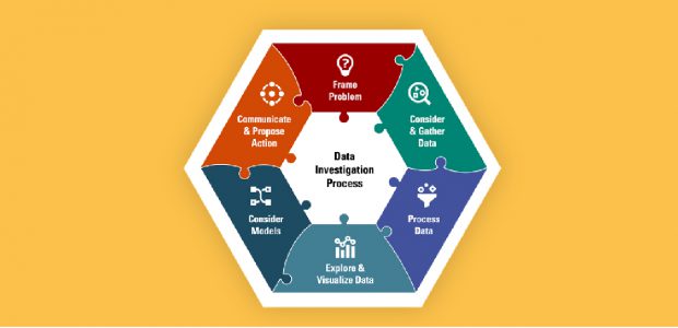
We propose a data investigation process involving six phases to give students in K–12 a richer experience with data investigations across disciplines. While engaging in the process may be linear, it is often nonlinear and dynamic in nature. Figure 1 illustrates how the six phases fit together like pieces of a puzzle and are needed for a holistic and productive approach to data investigations. By engaging in and connecting various phases, investigators can make sense of a real-world issue through data and make evidence-based claims and inferences to propose solutions to a problem. Sense-making and interpretation occurs throughout the process, rather than only at the end of an investigation. The six phases are briefly described in Table 1.
Table 1: Six Phases of a Data Investigation Process

When you Frame the Problem, you develop an understanding of the context of the real-world phenomena and broader issues. You pose one or more investigative questions that could use statistical approaches to answer your question(s) when considering the variability inherent in the context. Problems and questions may need to be revised or refocused based on the work in other phases.

During the Consider and Gather Data phase, you consider and collect the types of data needed to answer your questions and attend to other issues related to collection, measurement, design, methods, potential biases, and ethical concerns.

In the Process Data phase, you use strategies and techniques for processing and structuring data, such as obtaining data in a usable format and deciding what to do about possible erroneous/invalid and missing data. You also consider processes that might help focus your investigation, such as merging, sorting, grouping, transforming, or filtering your data.

When you Explore and Visualize Data, you create data visualizations (e.g., graphs, images, diagrams) that may be dynamic and statistical measures that will help you explore and reason about the data in relation to your question and context, as well as look for relationships among variables, patterns, and trends.

When you Consider Models, you explore and select models that help address your problem or answer your questions (e.g., statistical measures, static and dynamic data visualizations, predictive models, distribution models), while considering variability, uncertainty, and the assumptions needed for your model to be viable.

In the Communicate and Propose Action phase, you connect and interpret results and models to the context and make evidence-based claims in relation to a broader problem and specific investigative question. You devise and enact a strategy to convey and interpret results and models to your audience. You also make recommendations or take actions based on the recommendations from your evidence to solve your problem or question, which may include revisiting data from a new perspective or collecting additional data.
By talking with data scientists, we learned data investigations often do not emerge and proceed linearly from Frame a Problem to Communicate and Propose Action. For example, you may begin with a set of data that has already been collected and preliminarily Explore and Visualize Data, often called exploratory data analysis. From what is noticed, you may move into Consider and Gather Data to interrogate the data source, make sense of different measures and values you noticed (e.g., anomalies or outliers), and decide to use different strategies to Process Data in meaningful ways (e.g., filter or subset the data, merge several data sets, create new variables from existing ones). You may then dive into resources to Frame the Problem by making sense of the bigger context the data represents and pose a targeted statistical question involving only a few variables in the data set. From there, the appropriate data for the variables of interest would be selected, and you may proceed to Consider Models and require additional work in the Explore and Visualize Data phase. Deciding how to Communicate and Propose Actions may spark new or additional questions that require further investigation with the data at hand or additional data collection and processing.
Illustrating a Data Investigation
In fall 2021, our team won first place in a lesson plan contest sponsored by the Data Science 4 Everyone Coalition. This lesson builds on research of how real-world data investigations can be used to engage students in learning key concepts in data science and statistics using a free online data visualization tool (CODAP) and data set of 635 roller coasters from US amusement parks in operation in spring of 2020. The lesson focuses on understanding characteristics of roller coasters and sharing insights about trends and relationships on a blog to help others inform their own choices about riding roller coasters.
We purposefully use a context many students might have experience with, at least through pop culture and social media. Roller coasters also have many measurable characteristics that are both quantitative (top speed, height, length of track, year opened) and categorical (type of material, seat arrangement, scale of the ride). They also have geographic locations that can make them relevant to students. These variables can quickly engage students in making sense of the phenomena and use their real-world and scientific understanding to make sense of data trends and patterns.
Throughout the lesson, we make explicit connections to the six phases of a data investigation process using the labels and icons shown in Table 1.
Spend Time Considering and Gathering Data to Frame the Problem
In typical class experiences with data, students are often given a data set and asked to immediately make graphs or compute statistical measures, even if the data comes from a real-world context. Data investigations require an understanding of the phenomena you are investigating. Data is not neutral, and the variability inherent in data is inextricably tied to the context that generated the measured values. Thus, making meaning of data requires making sense of the data context.
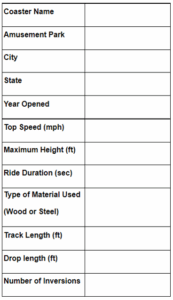
In this investigation, students are asked to help people understand the characteristics of different kinds of roller coasters in their own region (South, West, Midwest, Northeast) and perhaps how characteristics of coasters in their region (a subset of data) compare with those in other regions (using all 635 cases). To help students understand the phenomena of roller coasters, they begin by collecting data about a single roller coaster using the data card in Figure 2. Coaster enthusiasts have created extensive websites for chronicling and archiving data about roller coasters. Students explore several websites to gather data about characteristics of a single roller coaster.
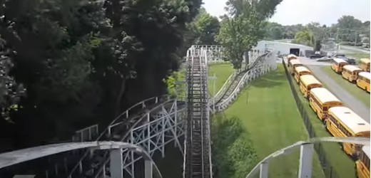
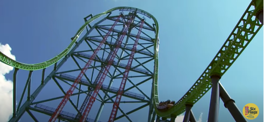
Since not everyone has ridden a roller coaster, we provide two point of view (POV) videos that capture the experiences of riding different roller coasters. The first is a wooden coaster called the Jack Rabbit at the Seabreeze Amusement Park in New York. Even though it is one of the oldest US roller coasters still in operation, it was the fastest at the time it was built. The other roller coaster is Kingda Ka, a steel coaster located at Six Flags Great America in New Jersey, which was the tallest and fastest coaster in the world when it opened in 2014.
Before watching both videos, ask students to consider the following question: What physical aspects of roller coasters make them exciting or scary? While watching the videos, get students to describe what they notice and how different features affect a rider’s experience.
Using data students gathered on their data card, have students share by asking the following:
- Who found a pretty fast roller coaster? Did anyone find a roller coaster that was faster than that one? What should be considered fast for a roller coaster?
- Do any students have missing data about their roller coaster? Did you have trouble finding some of the characteristics of a roller coaster? Did you have to go to more than one website to find information?
- Did anyone find conflicting measurements on different websites about their roller coaster? Why might there be different measurements on different websites?
To help students imagine how their data card about a single roller coaster can be made into a larger data set, have them imagine combining all their roller coasters and the measurements they found into a collection. This would be a data set with “X” roller coasters (X=number of coasters found by students in the class). For each case in the data set, students found information about 12 characteristics of a roller coaster (name, amusement park, etc.) we are going to consider attributes (or variables).
Collecting and discussing their own data for a single roller coaster helps students understand where data comes from, how characteristics of roller coasters are quantified and categorized, and the structure of a data set. Watching POV videos and discussing what makes them thrilling or scary helps students see the inherent variability across roller coaster characteristics and can spark better understanding of the measurements recorded in the data set. Together, these experiences immerse students in the first two phases: Collecting and Gathering Data and Framing the Problem.
Students are now ready to either pose their own statistical investigation question or start by pursuing one posed by a teacher. We often start with the following investigative question: How tall do roller coasters in your region of the US tend to be?
There is inherent variability in this question, and since students have already watched two videos with roller coasters of different heights and collected and shared data about other coasters, they anticipate seeing that variability represented in a distribution.
Students begin their exploration by only using a subset of the full data set by examining roller coasters in states near them. We have four CODAP pre-created for students that only show roller coasters within a certain region (South, West, Northeast, Midwest) and only include 12 variables. The remaining cases and nine more variables are hidden in the table (and students access these later). We propose starting with a smaller set of data for the following important reasons:
- The coasters and amusement parks are likely to be familiar and allow for better contextual reasoning.
- The smaller samples have more than 100 roller coasters in them, which is big(ger) than most of their prior experiences with data, but should not feel too overwhelming.
- There is an opportunity to notice trends and relationships and wonder if those will be similar or different if they examine coasters in a different region or the entire set of 635 coasters—promoting reasoning about expected variability between samples and a sample and a population.
- There is an opportunity for students to begin with a few quantitative variables and one particularly interesting categorical variable (material type).
- Students can start wondering about other characteristics of roller coasters not in the initial nine variables, which leads to posing new investigative questions requiring different measurements or categorizations to answer.
Let Students Explore and Visualize Data
When students have access to big(ger) multivariate data, we have seen a question about how tall coasters tend to be, although initially about a single attribute, often gets students quickly into noticing trends and outliers. Students love to find out about the really tall or small coasters, and CODAP’s linked representations make that easy.
In Figure 3, a student is investigating the 223 roller coasters in the southern region of the US. They found the coaster with the most extreme MaxHeight was the Fury 325, which opened in 2015 at Carowinds park in Charlotte, North Carolina. This simple exploratory move of clicking on the dot the furthest to the right in the dotplot (Figure 3) quickly establishes for students a way to interrogate the data and will lead them to think about other variables in the data set. As the student scrolls over in the table, they notice the top speed for the Fury 325 is 95 mph, it’s track length is 6,602 ft., its drop length is 302 ft., it is made of steel, and it has 0 inversions (turning rider past 90 degrees). If they have the map open, they also can see North Carolina highlighted and the location of the park in Charlotte indicated with a blue dot.

Students notice there are many coasters that are not very tall (20 feet or fewer), a clump of coasters with height around 40–50 feet, and a clump around 100 feet. They can use various CODAP tools to overlay measures of center, shade regions, or add a boxplot to explore more formal statistical measures to describe the trends in this distribution. As students continue to make sense of the distribution of MaxHeight, they often begin to consider other characteristics of roller coasters that may be related to height, moving them into considering multivariate relationships. Our use of two POV videos of roller coasters from different time spans (1920 vs. 2014) and made of different types of material (wood vs. steel) often sparks curiosity about how those characteristics are related to height of coasters.
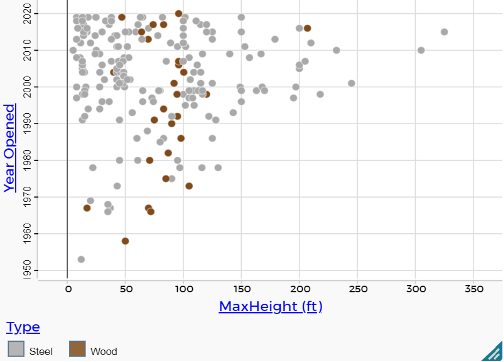
The graph in Figure 4 illustrates how two middle-school students explored a multivariate relationship they were curious about and created a graph with three variables (MaxHeight, Year Opened, Type). With this graph, students can not only answer the statistical investigation question about how tall coasters tend to be, but they can also add additional qualifying information to contextualize and support the trends they notice. For example, these middle-school students reasoned that older coasters tended to be shorter and more recently built coasters have a lot of variability in their height. They also reasoned that most coasters seem to have a height of 40–120 feet, but wooden roller coasters have less variability and are mostly 50–100 feet tall.
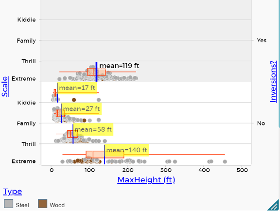
Students can use the same regional data CODAP file and expand the data set to view all 635 cases and nine additional variables. With full access to data for 635 roller coasters, we have found students are curious about investigating relationships among variables. For example, if students notice there are many coasters that have minimal heights (20 feet or fewer), they often start wondering if some of those are “kiddie rides” and can ask “How does the height of roller coasters compare across the scale of coasters (kiddie, family, thrill, extreme)?”
Consider the graph in Figure 5 with four variables and think about what students may notice and conclude about heights of coasters in different scale categories with respect to the type of material and whether or not a rider gets inverted.
Dig Further
As you think about other real-world phenomena and issues students can investigate with data they collect or generate through their own experiments or data collection methods (e.g., surveys), consider how you could structure these data investigations using the six-phase model in Figure 1 and Table 1 and help your students learn skills and processes to think like a data scientist.
Classroom-Ready Materials
Poster version of the data investigation process that can be used in the classroom
The Thrills of Roller Coasters: Lesson Plan and Student Handouts
CODAP document with coasters in the South visible: 14 states, 223 coasters, 12 variables
CODAP document with coasters in the West visible: 9 states, 122 coasters, 12 variables
CODAP document with coasters in the Midwest visible: 10 states, 134 coasters, 12 variables
CODAP document with coasters in the Northeast visible: 7 states, 156 coasters, 12 variables
CSV file of data from all 635 roller coasters
Further Reading
Lee, H. S.; Mojica, G. F.; Thrasher, E. P.; & Baumgartner, P. In press, 2022. Investigating data like a data scientist: Key practices and processes. Statistics Education Research Journal (special issue on data science education.)
Mojica, G. F.; Lee, H. S.; Thrasher, E.; Vaskalis, Z; & Ray, G. 2020. The data investigation process. In Invigorating statistics teacher education through professional online learning, Friday Institute for Educational Innovation: NC State University.
Editor’s Note: The work presented in this paper is partially supported by the National Science Foundation under Grant No. DRL 1908760 awarded to North Carolina State University. Any opinions, findings, and conclusions or recommendations expressed herein are those of the principal investigators and do not necessarily reflect the views of the National Science Foundation.