
By Shelly Sheats Harkness, Sarai Hedges, Kim Given
In the lesson, “Alphabet Statistics,” described by Marilyn Burns in her 1987 book, A Collection of Math Lessons (from grades 3 through 6), students explore letter-of-the-alphabet frequency of usage in print material. Over the years, Shelly Sheats Harkness used an adaptation of this lesson several times with middle-school students, high-school students, and preservice teachers.
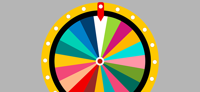
Harkness showed a video clip of the game show “Wheel of Fortune.” She told students her friend would be a contestant on the game show and needed to know what letters are the most frequently used so her friend can pick those letters. Students were then asked to make predictions and justify those predictions.
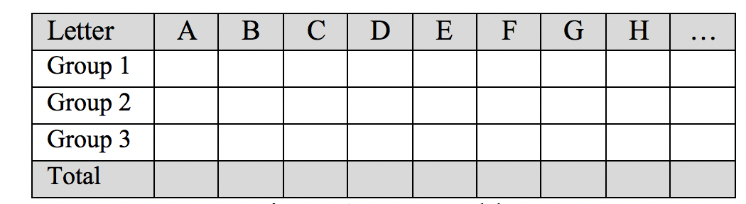
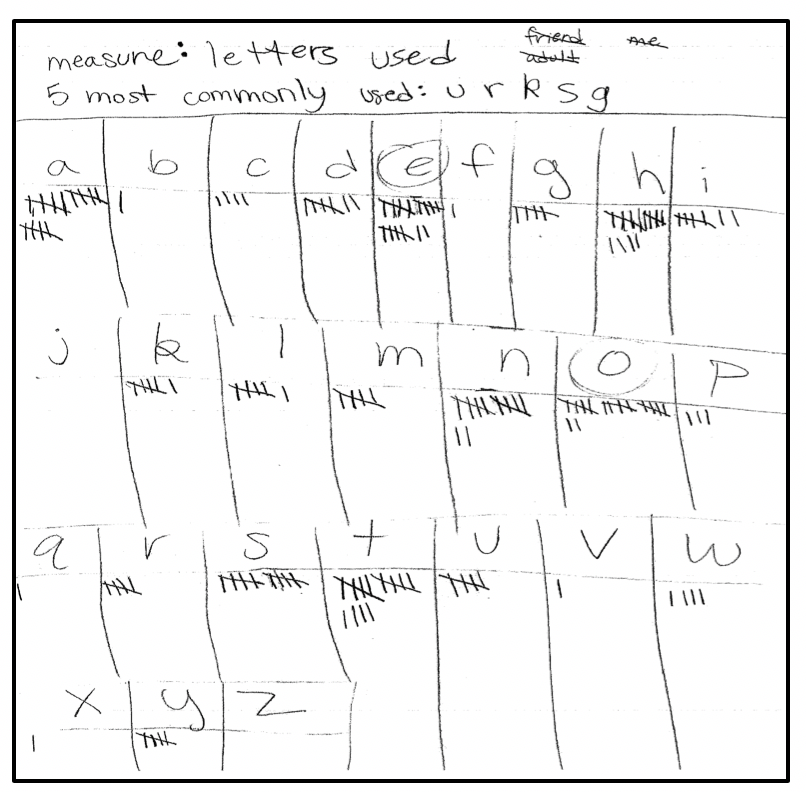
Next, Harkness explained how the class would determine the frequency of letters. Each group of students was given a page from the local newspaper and told to count the frequencies of letters of the alphabet from one paragraph. After each group tallied the frequencies, Harkness compiled the data from the entire class using a table (see Figure 1). Based on the frequencies, students were asked to revise their original predictions to help Harkness’s friend.
Harkness then revealed the list of letters from highest frequency to lowest frequency from Burns’ book:

[Note: Boxed letters indicate a tie in frequency in Burns’ book, and there was no citation for this list. Furthermore, using a search engine and the expression “letter frequency,” we learned from Wikipedia that there are typically three ways to count letter frequency and they result in different lists: count root words in a dictionary; count all word variants such as “add,” “added,” and “adding” and not merely the root words; and count the frequency of use in actual texts, which results in certain letter combinations like “th” becoming more common due to the frequent use of common words like “the.”]
Harkness asked questions such as the following:
- Why do you think there are four vowels in the most frequent six letters?
- What letters surprise you, and why?
- Why is your prediction different than the one from Burns’ book?
- Do you think your sample from the newspaper is a good representation? Why or why not?
- How could you improve data collection so it is more representative and gives my friend a better chance to win “Wheel of Fortune”?
Technology Twist
After reading Statistical Education of Teachers (SET) by Christine Franklin et al., it seemed evident we could improve this lesson by following the recommendations outlined within and make it more relevant to middle-school students. Kim Given implemented the lesson with recommendations in her seventh-grade classroom. These students were taking algebra and learned to make scatter plots. Prior to algebra, they had experienced some probability. Statistics was not an emphasis, and the focus was on definitions of terms and graphing when it was addressed.
In the SET document, Franklin et al. noted the statistics problem-solving process includes formulation of questions, collection of data, analysis of data, and interpretation of results. Additionally, the authors state, “A statistical question is one that anticipates variability in the data that would be collected to answer it and motivates the collection, analysis, and interpretation of data.” Finally, statistics involves both context and variability. Using these notions from the ASA, we discussed ways to make the original lesson align.
When Harkness used this lesson in the past, the students did not formulate the questions and the collection of data was imposed upon them. After some discussion, we decided we would use two class periods for the lesson, given the time-constraints of Given’s classroom period. Unfortunately, it seemed there was still not time to allow students to formulate the question. In this regard, we did not adhere to the first SET recommendation. Therefore, we wrote the scenario but allowed students to design the experiment, collect and analyze the data, and interpret the results they deemed would best help the teacher’s friend. We also wanted students to make a representation of the data other than merely the numbers in the table (Figure 1).
In addition to loosely following the recommendations outlined in SET, we aligned the lesson with the following Common Core State Standards for Mathematics, Grade 7:
- SP.A.1: Use a representative sample from a population to make valid generalizations about that population.
- SP.A.2: Use data generated from a random sample to draw conclusions about a particular characteristic of the population.
Finally, we wrote the problem scenario:
My friend, Sasha, is going to be on the television show “Wheel of Fortune.” There is a new category for the show called Pithy Text Messages. I told Sasha that the students in my class would help her figure out what letters she should select, the letters that are most prevalently used in text messages. How can we help Sasha? What would be an appropriate study design—data collection, analysis, and interpretation—in order to help Sasha?
We anticipated students might not know what “pithy” meant, so we were ready to define it if we needed to. Given also made sure at least one student in each group had a cell phone to use. Additionally, we expected the students would be motivated to explore this problem scenario because they could use technology—the text messages on their cell phones—as data.
Lesson Implementation
Day 1
Given launched the lesson by asking students if they were familiar with the game show “Wheel of Fortune.” Next, she showed a video clip from the show and asked students to individually, and then collectively (they were sitting in groups), make predictions about what letters they should pick and why. After a short discussion, Given dramatically unrolled the adding machine tape with the order of the letters—most frequently used to least frequently used. One student noted that two of the four least frequently used letters—Q and Z—are worth the most points—10—in the game Scrabble.
After this launch, Given introduced the scenario for the problem, asked student groups to discuss possible study designs, and posed the following questions:
- What were some considerations you made when you were trying to figure out how to plan a study?
- What were some things you were concerned about?
The following comments from students captured their thinking about study design and variability in sampling methods:
Student 1: … After a large enough sample size, the results don’t vary extremely or that if there are outliers, they don’t affect the overall … test?
Student 2: Whether a variety of people you texted … adults, you might text differently than you text your friends.
Student 3: … Like, we should have a conversation on text messaging somebody about anything and then … count the letters. Then also we should do it to multiple people ‘cause some people may use abbreviations and different abbreviations.
Student 4: Um, you kinda’ hafta’ figure out what defines a normal text message.
Student 3: Ooo!!! I have a new idea. Instead of, like, starting a new conversation, we should just go back and look at our old ones and, like, just look at, like, what our parents sent us as opposed to what our friends sent us as opposed to what our, like, coaches sent us.
Student 1: I’m thinking variety; however, the old conversations thing might be useful because that way the person does not—your results are not affected by the fact that you know it is part of the test.
Similar to suggestions by preservice teachers, Student 3’s first suggestion surprised us; it seemed they did not consider how sending text messages to their classmates and then counting letters might bias the sample results. However, after more discussion, consensus was reached that they would self-select archived text messages from three sources: themselves; parents; and friends.
The discussion next turned to sample size. Students suggested 100 letters from each of the three texts, but another student said, “No! That’s a lot.” They agreed that each group would tally the frequency of 50 letters in the three texts from different sources (as above) for a total of 150 letters. Based on the time constraints of the class period, this seemed reasonable to the students.
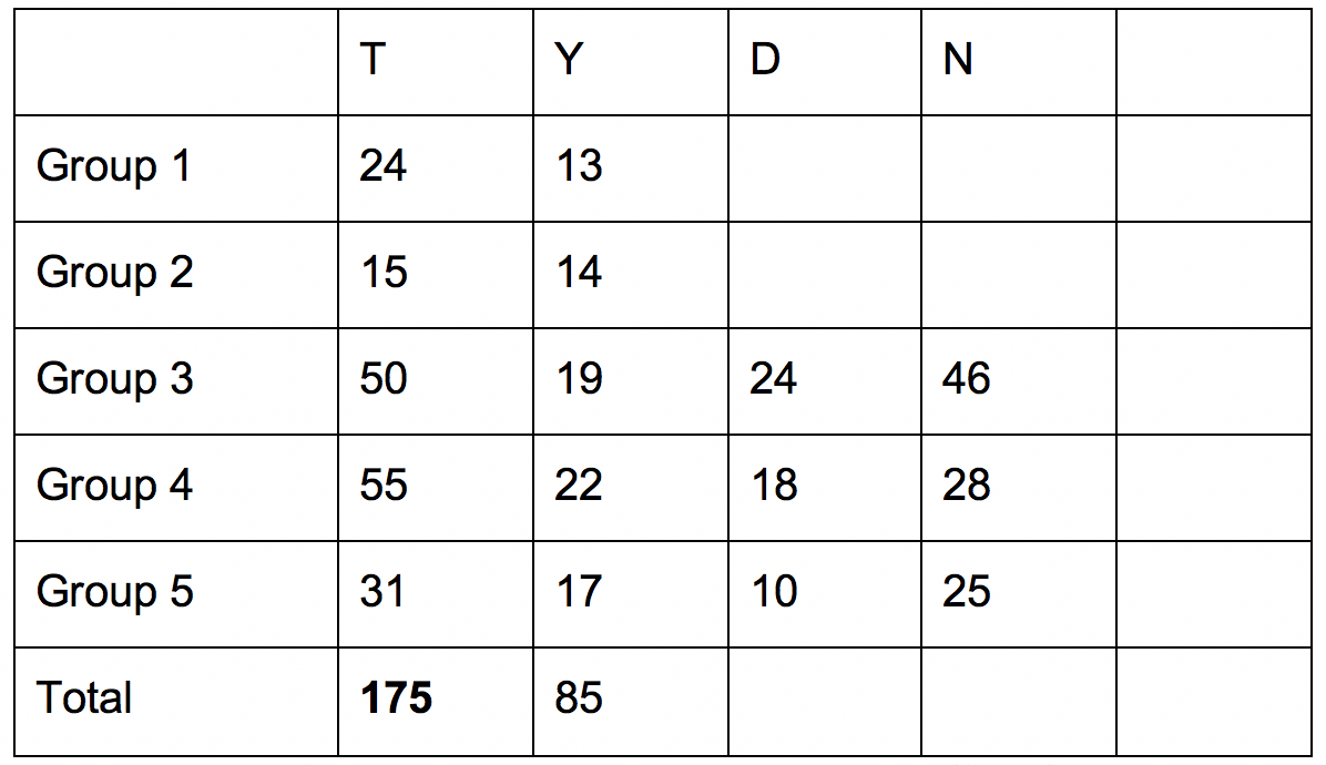
Given asked students to predict the frequency of letters in the text messages before they began to count the letters and recorded their predictions using Google Docs. [Additionally, she warned students to not share text messages meant to be private.] Students used their laptop computers to enter data into the document while it was displayed on the screen at the front of the classroom. The first row in Figure 2 shows the students’ predictions and the total frequencies. Given also created a second document with space for letters that had high frequencies but were not predicted beforehand (Figure 3).

Examples of the ways students tallied their letter counts are shown in Figure 4.
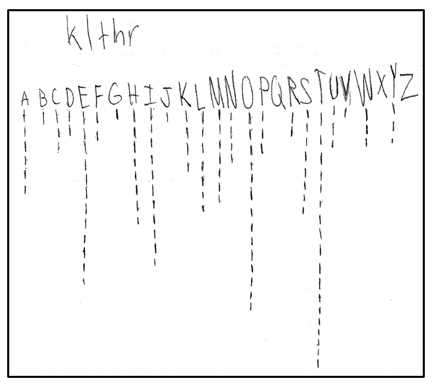
Although we assumed students knew how to use tallies, Student B’s recording method was more conventional than Student A’s. However, space might have been a factor in Student A’s recording method. After he or she wrote the letters across the top of the paper, it is possible the only option for tallying was to do it vertically.
Day 2
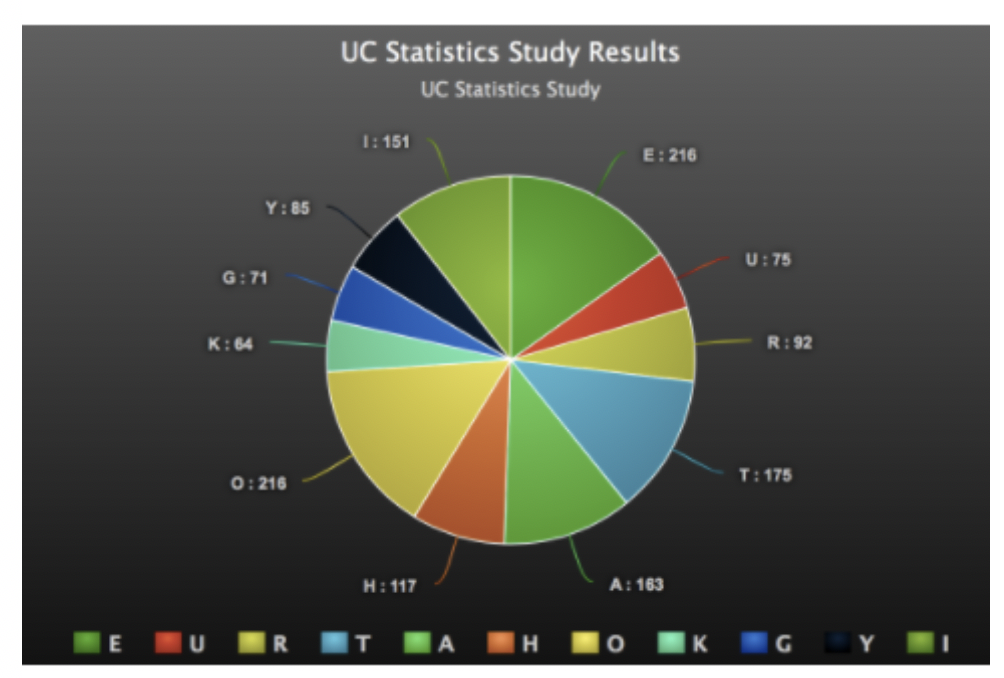
To begin class, Given asked students to make representations of the data for Sasha that would be easy for her to understand. Students self-selected what tools to use to make graphs. In their groups, they created bar graphs and circle graphs. Two groups used Piktochart, an online infographic publishing tool with built-in data management, and one group used Google Sheets. Another group created their representation by hand.
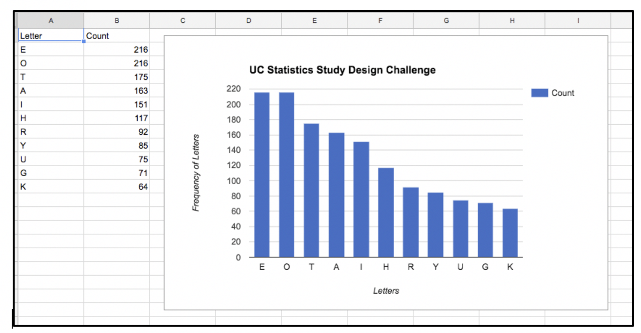

After groups shared their representations, Given asked them to discuss which representation they thought would be easiest for Sasha to understand and why. Given commented that it was interesting that the majority of graphs were bar graphs, though there was variety in vertical and horizontal arrangement. The students shared that the bar graphs, arranged by letter frequency, were the easiest to read.
The group that created the graphs based on arrangement of bars from greatest to least frequency used Google Sheets. The group choosing to draw their bar graph using graph paper did not organize bars by frequency of letter use, but agreed their scale of using the entire length of the sheet of paper to represent the highest frequency made the data variations clear. When the circle graph group was asked about their graphing choice, they responded that they wanted to see what the data would look like in a different format from the rest of their peers. They mentioned they originally planned to create a bar graph, but saw other groups had created them and remembered Given suggested a variety of representations would be appreciated.
Members of the circle graph group were happy with their results, but agreed a bar graph with bars in order by letter frequency would be more helpful to Sasha than the circle graph or hand-drawn bar graph. No students created a circle graph that represented relative frequencies. However, because the whole was the total number of texts, relative frequencies of different wholes were not needed to make comparisons.
Finally, during the summarization, Given posed the following questions and students responded [T is teacher and Ss is students]:
T: What are our hypotheses about why there are similarities between publications and texts?
Ss: Only certain words get shortened in texts.
In text to adults, we are more formal.
T: What technology impacts our text style?
Ss: Smaller keypads on smart phone means we might shorten words.
Autocorrect and text prediction – emoji.
Texting in the moment means it’s time sensitive; you use more abbreviations in a rush.
T: Do you have concerns about the validity of our study based on data collection?
Ss: Do we need to double check [the counts]? Have a second person review the data?
People might have lost place while counting.
Did everyone actually count 150 letters?
Some groups were larger than others.
Use a computer to help with data collection.
Get more data.
Some of the students in Given’s class thought the process of counting was tedious, and this was reiterated several times. This was interesting to us because preservice teachers did not complain about the counting process when we used this lesson with them. There was no discussion about the comment, “Some groups were larger than others.” Time was running out.
By allowing the students to create the study design, other important ideas such as bias and consent were reinforced. Students grappled with bias of a proposal to use texts created during the study and considered the ethics of participant consent during the discussion of whether to use non-archived or archived texts. Letting students create the study design also allowed us to identify the “components of variation-type thinking” as students grappled with the components of “noticing, dealing with, explaining, and displaying variation,” as discussed in “Statistical Thinking: An Exploration into Students’ Variation-Type Thinking” by Pfannkuch et al. and published in the New England Mathematics Journal.
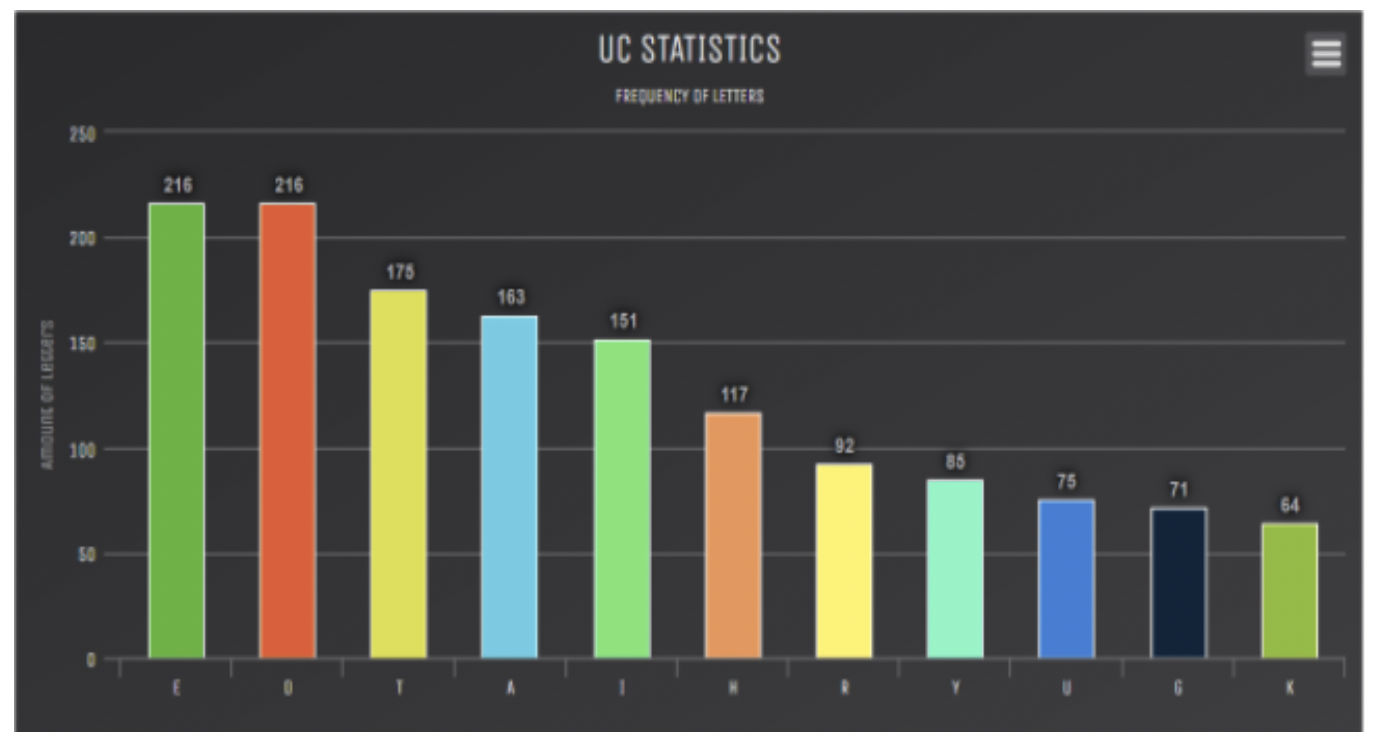
Finally, returning to the original scenario from Day 1, the students were asked how confident they were in telling Sasha the letters to choose. [They had decided the following order from most frequent:


This compared to (using newspaper data). Interestingly, the first six letters were the same but in a different order for each list, but the next five letters in each list were unique.] They said they felt confident.
We wondered about the fact that S, as it was in the original list, was not included and why K was. Perhaps the expressions “okay” or “K” are used colloquially with text messages. But why was S not included in the top 11 most frequently used letters from student data? Would other study designs have resulted in more use of S?
Again, we did not follow all the recommendations put forth in the SET document. Namely, we created the problem scenario. However, as an “exit-ticket” activity, teachers might consider asking students to pose other problem scenarios related to text messaging or technology topics of interest. This lesson with a new technology twist to a classic lesson might be the springboard for delving deeper into other problem scenarios that highlight aspects at the heart of statistics: context and variability.
For teachers who might want to use an extension for this activity, we suggest discussing the advent of the typewriter and the reason why the QWERTY keyboard was designed (to allow typists to work fast without the typebars getting stuck). There are excellent YouTube videos that show how antiquated typewriters worked. The teacher could ask students to compare and contrast another keyboard design such as the Dvorak and pose the following scenario:
Based on the results you found for Sasha and the Pithy Text Messages category, design a more efficient keyboard for writing text messages.
Conclusion
Because we attended to the guidelines set forth by the SET document and allowed students the opportunity to create the study design, this new twist on an old lesson showed us the statistical concepts of variability and representative random sampling were ideas still under construction or fragilely understood for students. As previously discussed, some students did not realize limiting the sample to messages created only by themselves would most likely limit the natural variability in text messages. However, by the end of the lesson, they did come to understand that stratifying the sample by using three archived sources (themselves, parents, and friends) allowed for more variability and created a more representative sample.
Although the concepts of variability and representative sampling were strengthened through the lesson, the concept of random sampling was not. Disadvantages of self-selecting from the strata of the three archived sources were not discussed, nor was the choice of sample size. Students would benefit from more guidance and discussion on these ideas in future statistics lessons.
Furthermore, the technology used (smartphones and text messages, Google Docs, Google Sheets, and Piktochart) made the problem interesting and relevant to students. Making the lesson more open-ended clarified what students knew and could do independently in a complex real-world scenario.
The original lesson incorporated a more close-ended investigation, which led to a “right” frequency of letters. However, only through allowing students to design the study, collect the data, and analyze and interpret the results (as recommended by SET) could they begin to make sense of the prevalence of variation, recognize how study design influences bias, and grapple with managing data sets. Students began to see why context matters, identify criticisms of study designs, and realize tentative answers to statistical questions can raise more questions. Students could use the results from this study design to pose other questions and design other studies related to texts and text messaging. They might even be motivated to use statistics to tackle a social justice issue and design a study related to the perils of texting while driving.
Further Reading
American Statistical Association. 2015. Guidelines for assessment and instruction in statistics education: College report. Alexandria, VA: ASA.
Burns, Marilyn. 1987. A collection of math lessons from grades 3 through 6. Sausalito, CA: Math Solutions Publications.
National Governors Association Center for Best Practices, Council of Chief State School Officers. 2010. Common core state standards for mathematics. Washington, DC: Authors.
Franklin, Christine A.; Gary D. Kader; Anna E. Bargagliotti; Richard L. Scheaffer; Catherine A. Case; and Denise A. Spangler. 2015. The statistical education of teachers. Alexandria, VA: American Statistical Association.
Pfannkuch, Maxine, Amanda Rubick, and Caroline Yoon. 2002. Statistical thinking: An exploration into students’ variation-type thinking. New England Mathematics Journal 34: 82–98.