

By Kirk Anderson and Mary Richardson, Grand Valley State University
On September 17, 2014, testimony was given at a House Veterans’ Affairs (VA) Committee hearing. Participants included a member of the Committee on Veterans’ Affairs, Rep. Tim Huelskamp (R-Kansas), and the chief of staff for the Phoenix VA Health Care System, Dr. Darren Deering. Rep. Huelskamp took issue with the use of Darrell Huff’s book, How to Lie with Statistics, in the training of Phoenix VA staff. (The book was banned from such use by VA Secretary Robert McDonald soon after.) In particular, Rep. Huelskamp grilled Dr. Deering about a graph that appeared in a report issued by the Phoenix VA. The graph, apparently created in Excel, was a combination bar graph and line graph.
This is not the only VA scandal to appear in the news in recent years, but it gives us a rich example to use when teaching statistics. There are three main aspects of this example that can be used in class. First, there is a distorted graph. Second, there is the response to the graph by Rep. Huelskamp and the resulting media coverage. Third, there is Darrell Huff’s book, How to Lie with Statistics.
If you have access to Huff’s book, you might start there. Show your students a few excerpts from the book to see if they think banning its use was a good idea. As Michelle Ye Hee Lee says in an Arizona Republic story, “The book does not explicitly encourage readers to lie. The title is intended to be ironic and reflects the cheeky, almost farcical, tone Huff carries through the book to show readers the many ways statistics are manipulated.”
Indeed, Huff says the following on Page 9:
This book is a sort of primer in ways to use statistics to deceive. It may seem altogether too much like a manual for swindlers. Perhaps I can justify it in the manner of the retired burglar whose published reminiscences amounted to a graduate course in how to pick a lock and muffle a footfall: The crooks already know these tricks; honest men must learn them in self-defense.
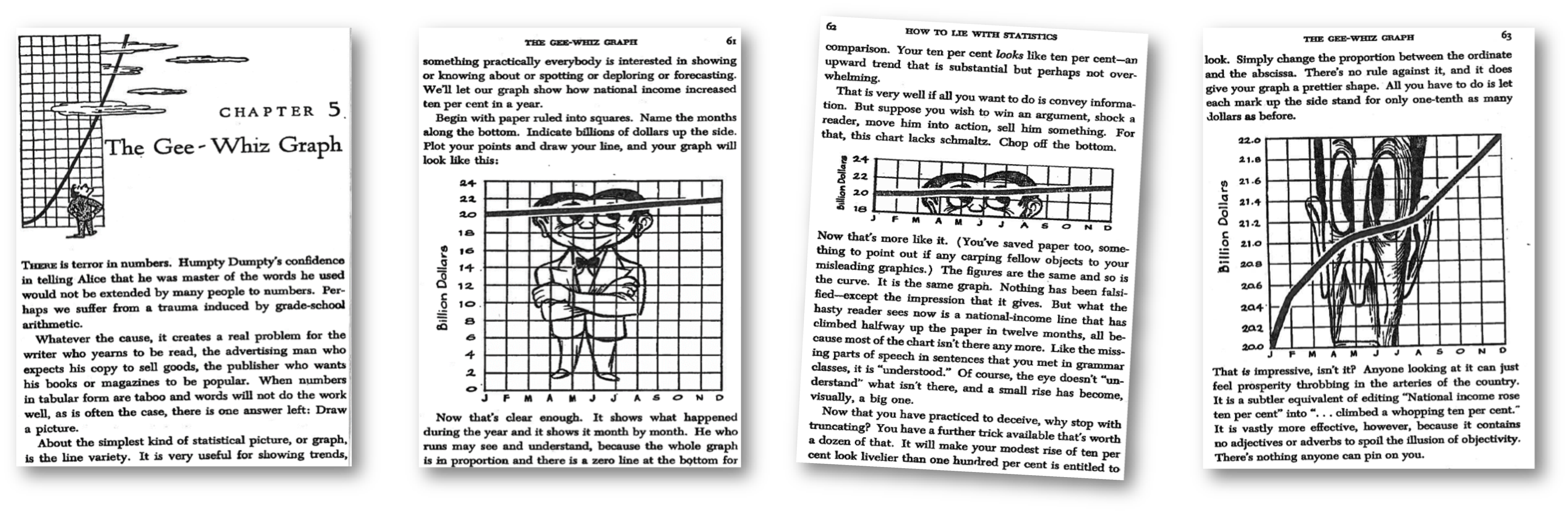
The part of How to Lie with Statistics that most pertains to the Phoenix VA graph is on pages 60–63 (see Figure 1). There, Huff points out that if you have a slight change in something over time, you can exaggerate the trend by not starting the graph at zero (any good statistics student knows to always start the vertical axis at zero) and further adjusting the range and amount of page the vertical scale takes up. On Page 61, we see a “boring,” but honest, graph showing an unimpressive increase over time. Page 62 shows a truncated version of the graph, which makes the increase appear slightly steeper. But the real magic occurs on Page 63, where Huff suggests we can stretch the vertical axis to our heart’s desire, thereby exaggerating the increase dramatically (and misleadingly).
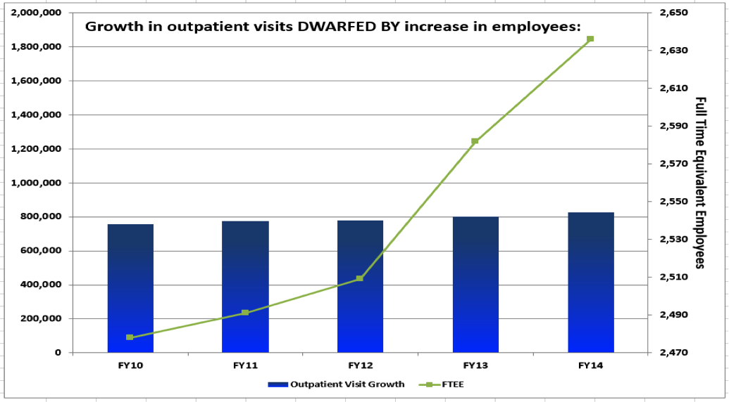
After discussing the honest and misleading graphs, ask the students to consider the Phoenix VA graph (see Figure 2).
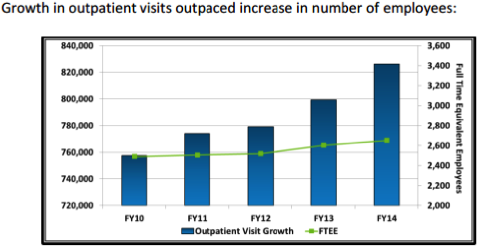
A sharp student will notice that the increase in outpatient visits is exaggerated by starting the vertical axis at 720,000. Until they examine it more closely, they might not be able to see that the opposite was done for the data on the second vertical axis, number of employees. The (increasing) trend there is purposefully downplayed by the choice of such a wide range (2,000 to 3,600) for the axis and the arbitrary placement of the line graph.
After a brief critique of the graph, show your students the six-minute video between Rep. Huelskamp and Dr. Deering. They should enjoy seeing the graph on television, and even if they don’t usually watch C-SPAN, there is enough tension and humor to keep their attention. Rep. Huelskamp correctly finds fault with the graph, pointing out how the two variables—outpatient growth and number of employees—aren’t on the same scale. He doesn’t explicitly mention the ranges used for each variable, but claims the title is misleading and the trends are both “about flat.” At the end of the video excerpt, Rep. Huelskamp asks Dr. Deering to “fix up” the graph. Perhaps this is our job!
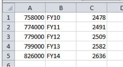
The graph was apparently created in Excel. With the Phoenix VA graph in view, students can enter the data shown below in Figure 3, then try to recreate the graph. Note that Column A contains the number of outpatient visits, Column B contains the (fiscal) year (2010–2014), and Column C contains the number of (full-time equivalent) employees.
The bar chart part is easy. In fact, you and your students will undoubtedly get a kick out of the Phoenix VA graph essentially being the default graph that appears in Excel! Here are the directions:
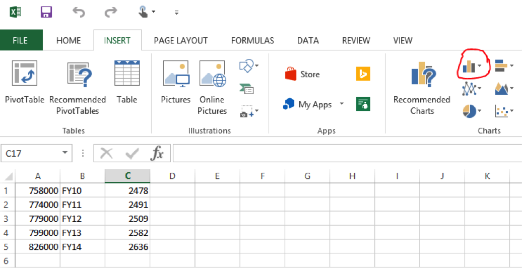
As displayed in Figure 4, click the INSERT tab. From Charts, click the icon that looks like a (vertical) bar chart and choose the first option, which gives a “2D column clustered” bar chart.
A blank chart area appears. Right click on the blank object and choose Select Data. Select the numbers in Column A from the spreadsheet, as shown in Figure 5.
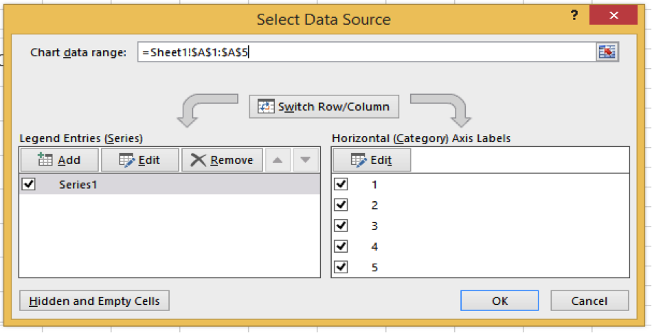
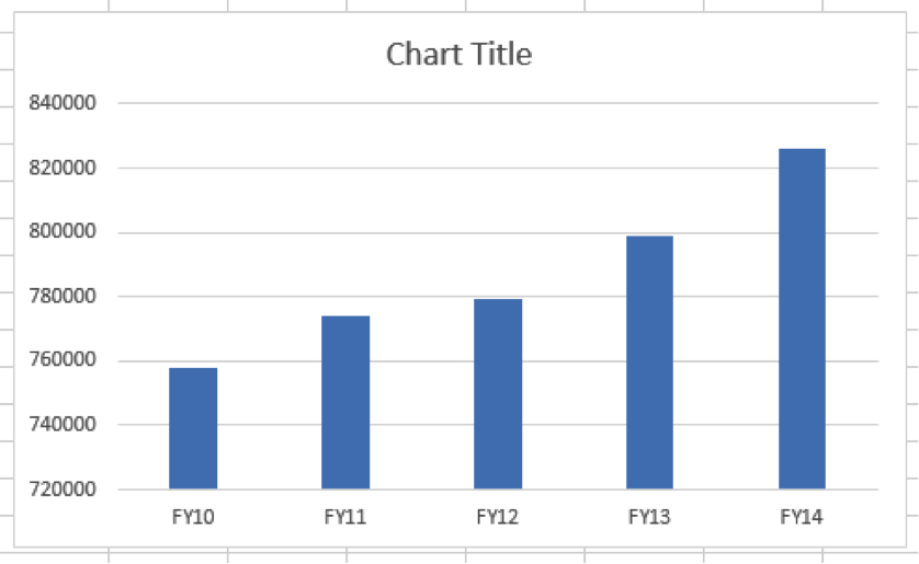
Click Edit under Horizontal (Category) Axis Labels. Select FY10–FY14 from the spreadsheet and click OK, then click OK again. We haven’t added the line graph yet, but note how similar the bar chart in Figure 6 is to the Phoenix VA graph. One merely needs to change the solid fill to a gradient fill! Note how the axis starts at 720,000. Ask your students: Is the Phoenix VA guilty of starting the graph at a value other than zero, or is Excel to blame?
The Phoenix VA may have used the first result that appears in Excel for this part of the graph, but they had to expend a little more effort to get the rest of it. Directions to add the line graph follow in Figure 7. Note the directions depend on which version of Excel you are using; the directions below are for Excel 2013.
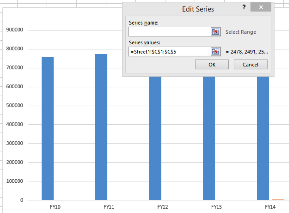
Right click on the chart and choose Select Data. Under Legend Entries (Series), click Add. In the Series values field, delete the “={1}” and select the column C values.
Note that the Y axis now starts at zero! (It won’t stay that way.) Click OK, then OK again.
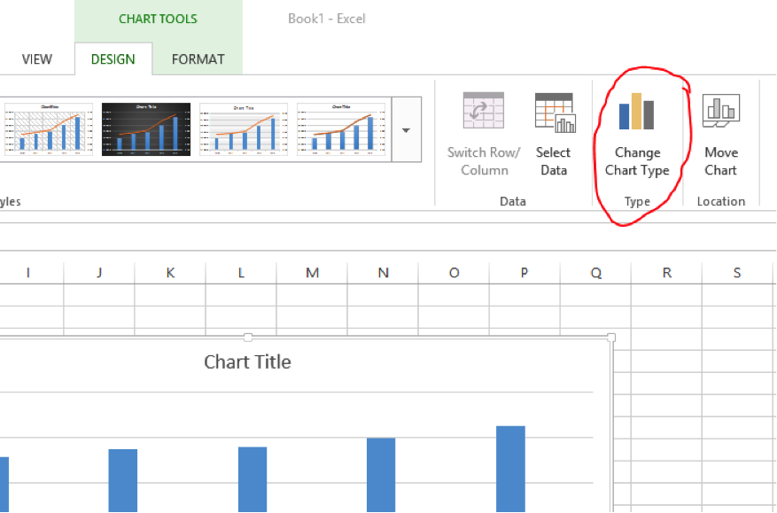
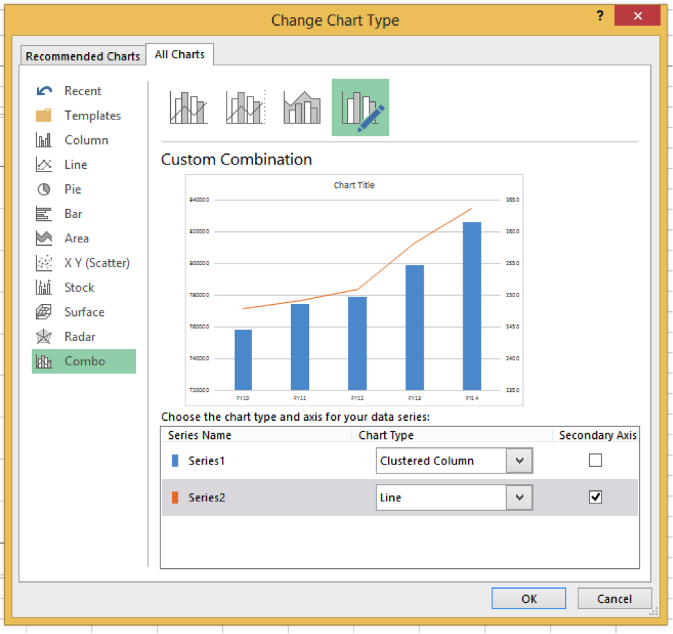
The DESIGN tab should be active so that, at the top right of the screen, you see Change Chart Type (see Figure 8). Click this.
At the left of the dialog box, select Combo. Make sure the Chart Type is Clustered Column for Series 1 and Line for Series 2. Also, select Secondary Axis for Series 2. Click OK. See Figure 9.
Compare this graph to the one the Phoenix VA presented to Congress. How does it differ?
This is where the fun really starts. As your students play around with the secondary axis range so their graph matches the Phoenix VA graph, you can start to address important questions such as the following:
- Should the data for outpatient visits and number of employees be plotted on the same graph?
- What considerations should determine the placement of the line graph?
- How should the range of values for the primary and secondary axes be determined?
Here are some example student responses from our experience:
- “You should not put two sets of data in the same graph that have different y axes. They should have separate graphs that start at zero. The increases in outpatient visit growth look much more dramatic than they really are.”
- “These graphs should not be superimposed on each other, given that their scales are totally different, and neither even begins at zero.”
- “This should be two graphs instead of one.”
- “The top half of the FTEE graph is white space, which minimizes trends.”
Using Excel 2013 to manipulate the secondary axis, right click the line graph. Choose Format Data Series. Note the task pane that appears on the right. Under SERIES OPTIONS, choose Secondary Vertical (Value) Axis. Click the icon that looks like a bar chart. See Figure 10.
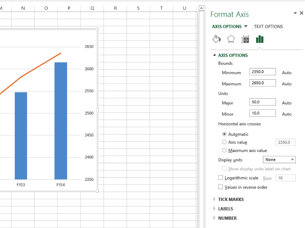
Now you can change the minimum and maximum bounds to mimic the Phoenix VA graph. Change the bounds to 2,000 and 3,600. What a difference! Of course, you can also change the color to green, etc., if you care to make it totally match. Adding the title (“Growth in Outpatient Visits Outpaced Increase in Number of Employees”) is highly recommended. You and your students can continue to ponder important questions such as the following:
- What is misleading about this graph?
- How did the Phoenix VA manipulate aspects of the graph to make the title ring true?
- Can we make the opposite claim with a different version of the graph?
- Is it possible to create an honest version of the graph?
Following are more example student responses from our experience:
- “I would suggest to create a graph that shows the relationship or ratio of patients to employees over each year.”
- “If you were to split the graphs and start the axis for both at zero, you would see a fairly similar trend in both.”
- “In order to effectively display something like this, you should make a graph showing the ratio of outpatients to employees to gauge if that proportion is widening, which it likely isn’t.”
The answer to the question, “Can we make the opposite claim with a different version of the graph?” is “Yes,” and it might look like the graph in Figure 11. Note the wider than necessary range for the primary axis and the narrow range for the secondary axis. (Note also the changed title!)
“Is it possible to create an honest version of the graph?” is tougher to address. It might make sense to set the graphs aside for a minute and focus on the numbers. Did the Phoenix VA actually have a case to make? In other words, do the data for this five-year span indicate the number of outpatient visits rose at a greater rate than the number of employees? Or was Rep. Huelskamp correct when he said both were “about flat”?
One way to address this is to compare the percentage change. Since the number of outpatient visits went from 758,000 to 826,000, this is a 9% increase. The number of employees went from 2,478 to 2,636, which is a 6% increase.
This is a rich example for critiquing a graph, recreating many versions of the graph, and discussing what can lead to a misleading graph.
Unfortunately, there are many more examples of bad graphs in the media. On September 29, 2015, another member of Congress drew attention to a bad graph, but unlike Rep. Huelskamp, this member wasn’t aware of how misleading the graph was, or even who created it. The website Politifact posted a summary of the exchange between Rep. Jason Chaffetz and Planned Parenthood President Cecile Richards, which not only includes the misleading graph, but also gives their corrected version of it. A two-minute video also shows some of the exchange between Rep. Chaffetz and Richards.
If you watch, listen to, or read the news often enough, you will spot your own examples. To save time finding bad graphs, we recommend Kaiser Fung’s Junk Charts blog, which regularly posts misleading graphs with a critique and a corrected version of the graphs. Another method to find more examples is to simply search for terms such as “bad graphs in the media.” Have fun!