ASA and New York Times Partner to Create ‘What’s Going On in This Graph?’
By Sharon Hessney, Donna LaLonde, and Rebecca Nichols
In this column, we want to highlight an exciting new partnership between The New York Times Learning Network and the American Statistical Association.
Fifteen years ago, The New York Times started the Learning Network—a free, online feature that provides materials to help teachers use the newspaper in their classrooms. Two former humanities teachers—Katherine Schulten and Michael Gonchar—led the charge by offering teachers daily writing prompts, news quizzes, and contests. Their following with English language arts and history teachers has been strong and is growing, but there has yet to be many offerings that focus on quantitative aspects of reporting.
What’s Going On in This Graph?, a new monthly activity from the ASA and The New York Times Learning Network is filling that gap.
On the second Tuesday of each month at 9 a.m., WGOITGraph? presents a New York Times graph. From 9 a.m. until 2 p.m., a team of ASA teachers moderate the live discussion of student responses based on “What do you see?” and “What do you wonder?” Many teachers might recognize these questions from the Math Forum/NCTM’s Noticing and Wondering Strategy. To learn more about how to use this strategy, go to Annie Fetter’s video.
On the Friday following the release, The New York Times Learning Network publishes a “reveal”—a follow-up that includes the original article, summary of student responses, additional questions students may want to answer, and stat nuggets. These stat nuggets inform the teachers, who are usually not statistics teachers and may not even be math teachers, of the definition of statistical terms and how they are represented in that month’s graph.
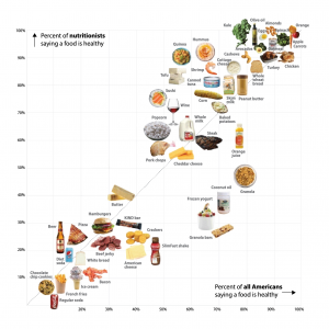
All WGOITGraph? activities are archived on The New York Times Learning Network site to use at any time. Already in the archives are scatter plots, time series, and choropleths (colored maps) on climate change, nutrition, jobs, and e-commerce. Other topics that will probably be featured this school year are gun violence, the DACA Dreamers, and fiction writing.
What’s Going On in This Graph? is an excellent formative assessment used as a class starter that takes 10–15 minutes. Project the graph or hand out copies and have students “think-pair-share” their insights and questions. Another method involves the students writing responses to the questions in their math journals. Both approaches could be augmented with whole group discussion. The whole group discussion could form the foundation of the online response.
The online reveal will include the graph’s article, sample responses, additional questions, and explanations of key statistical terms. As a final activity, the students could write their reflections about the information provided in the reveal.
ASA member Sharon Hessney—a Boston Advanced Placement Statistics teacher—selects the graphs, writes the releases, and coordinates the online moderators. ASA student-response moderators have been Corey Andreasen (Wisconsin and Qatar), Jared Derksen (California), Erica Chauvet (Pennsylvania), and Paul Buckley (Washington, DC). Senior editors are Roxy Peck (ASA Fellow and professor emerita of statistics at California Polytechnic University, San Luis Obispo) and Christine Franklin (ASA K–12 Statistical Education Ambassador and professor emerita of the University of Georgia).
Teachers can freely sign up for The Learning Network’s weekly Friday newsletter, where the month’s WGOITGraph? is pre-released. Although students need to register to participate in the live, online discussion about the graph, only an input name and location is needed (e.g., Sharon from Massachusetts).
For more information about how to participate in this free resource, visit this introductory post or listen to this episode of the Data Stories podcast.