Why 0.05? Two Examples That Put Students in the Role of Decision Maker

Leah Dorazio
Any teacher of Introductory Statistics has heard this question more times than they can remember: “Why 0.05?” Here, the value 0.05 refers to the significance level in a hypothesis test. A nice overview of hypothesis tests is described in the Fall/Winter 2015 issue of STN.
In this article, I provide a brief review of the concepts of hypothesis test and significance level. Then, I describe two activities for teachers to proactively address the question of why 0.05 with their students, one tactile and numerical and the other online and visual. These activities challenge students to use their intuition and probability sense to make their own decisions.
In a hypothesis test, there are competing claims, or competing hypotheses. The alternate hypothesis HA asserts that a real change or effect has taken place, while the null hypothesis H0 asserts that no change or effect has taken place. The significance level defines how much evidence we require to reject H0 in favor of HA. It serves as the cutoff. The default cutoff commonly used is 0.05. If the p-value is less than 0.05, we reject H0. If the p-value is greater than 0.05, we do not reject H0.
But why use a cutoff of 0.05? An interesting look back at the thinking of the founders of hypothesis testing is described in a 2013 article in the magazine Significance, but that complicates the issue rather than explains it. A simple response might be to say that it is merely a rule of thumb or a mutually agreed upon value within the statistical community. Students are not satisfied with this answer. One might go on to assert that a value two standard deviations away from the expected is considered unusual. To connect this to the logic of hypothesis testing, as the probability of an event falls below 5%, we become more and more surprised if we witness it occurring. Students get this logic, but they still want to know why 0.05 and not some other number.
The first example involves my favorite way to introduce hypothesis tests and their corresponding logic. The basic idea is described by Stephen Eckert in the Journal of Statistics Education. I have heard of slightly different versions from various teachers over the years. It goes like this. Buy two decks of cards. Create a modified deck of cards that contains all red cards. In class, present the students with a game based on the color of the cards drawn. As an example, say that the first student who draws a black card will get $10. Randomly pick students one by one and have them select a card, showing the card to the class. Put the card back into the deck and reshuffle. (This is important—once, I did the drawing without replacement and two students both got a red Jack of Hearts!). After three red cards are drawn, students will get increasingly excited, thinking that they might be the winner; they are not yet suspicious. One by one, they continue to draw only red cards. Four red cards in a row, five …
At this point, you will begin to hear a lot of grumbling and questioning if the deck is rigged. With an exaggerated show of being offended, ask, “Why would you say that?”After a few responses, someone will eventually say, “Because if the deck were fair, it’s really unlikely that we would get five red cards in a row.” Exactly. Now they have experienced and verbalized the logic of hypothesis testing on their own.
At this point, we can investigate the probabilities. If the deck were fair (p=0.5), the probability of getting four red cards in a row would be: (1/2)(1/2)(1/2)(1/2)=(1/16)=0.0625
This is where students start to get suspicious, but will not yet denounce you. If the deck were fair (p=0.5), the probability of getting five red cards in a row would be: (1/2)(1/2)(1/2)(1/2)(1/2)=(1/32)=0.0315
And yes, at this point, students will be arguing that the deck is unfair (that is, rejecting the null claim of a fair deck). These calculations serve as a first pass in explaining why a cutoff or significance level of 0.05 is reasonable. It is around where our natural suspicion starts to kick in.
There are many variations on how to carry out this demonstration and how to wrap it up. I stop after five draws, saying that I want to stop while I’m ahead. If you continue, students will become too certain that the deck is unfair. With five draws, there is still doubt. At this point, students can choose to believe the deck is unfair or they can choose to believe they were just unlucky. Students will, of course, want to see the deck, which you should by no means show them. As I tell my students—the whole practice of statistics is dealing with uncertainty; there are no correct answers against which you can check the decisions you make. I like to put one black card in the deck. At the end, I will say, “I cannot tell you whether the deck is fair or unfair, but …” and I show them the black card. This gives them a shock and makes them reconsider their conclusion based on this new evidence. If you want to really confound the students, steam open one of the new decks, and, after creating the modified deck, carefully reseal it. This way, you can make a big to-do of showing the class it is a brand new deck (thus increasing the threshold of suspicion).
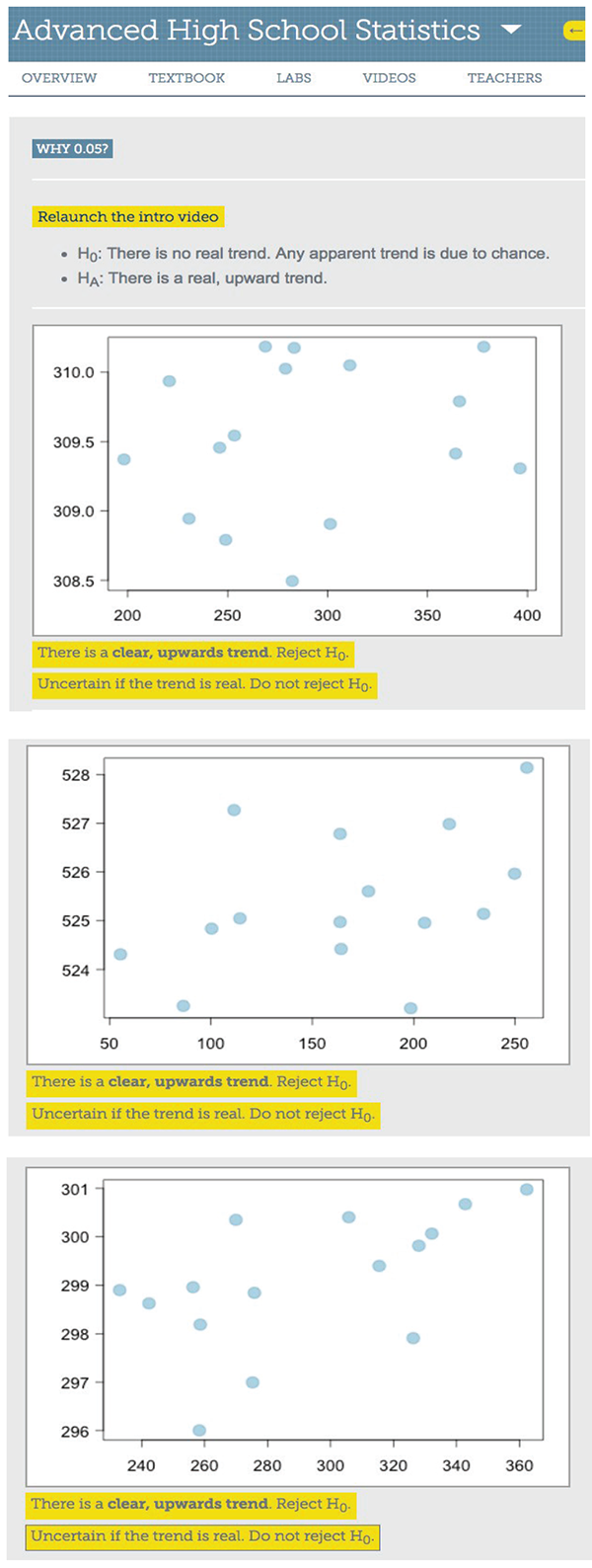
Figure 1: Three plots from openintro.org/stat/why05
The second example comes from OpenIntro.org, a group (for which I am a volunteer) that produces free and open-source statistics resources, including introductory statistics textbooks and TI and Casio graphing calculator tutorials. Instead of approaching the why 0.05 question from a quantitative angle using a one-sample test for proportions, it approaches it from a visual angle using scatterplots and the hypothesis test for a significant linear relationship. After an introductory video, the visitor is presented with a series of 15 scatterplots (three of which are shown in Figure 1). For each one, they must decide whether the graph provides enough evidence of a real, upward trend or not enough evidence for a real, upward trend; that is, whether they reject H0 or do not reject H0. After completing this task, a follow-up video explains the results and then the visitor is presented with their individual results based on the choices they made for the set of scatterplots. Each graph has an associated p-value for the test on the slope of the regression line.
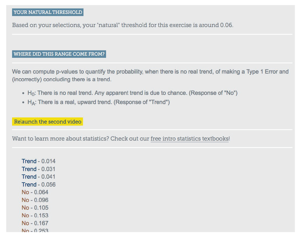
Figure 2: The author’s results from openintro.org/stat/why05
Now the “Aha!” moment. The next screen reveals all 15 graphs with their associated p-values, and for each one whether the visitor rejected H0 or did not reject H0 based on their intuition and their visual inspection. I did this activity, and, as seen in Figure 2 the cutoff for me was 0.06! This means I found evidence for a significant linear relationship for the graphs that had an associated p-value less than 0.06 and did not find evidence for a significant linear relationship for the graphs that had an associated p-value greater than 0.06. Of course, each individual’s cutoff may vary. This activity is great to do in class (the videos can be skipped, with the teacher filling in the necessary explanation). When all the students finish, make a dotplot of the cutoffs each student (subconsciously) used and find the class average. You will find that this value is consistently close to 0.05!
There are limitations to focusing too narrowly on the p-value. The ASA recently published a statement on p-values, stating: “Well-reasoned statistical arguments contain much more than the value of a single number and whether that number exceeds an arbitrary threshold.” As teachers, we must also address issues of experimental design, the question of causality, and the true interpretation of p-value. Nevertheless, these two introductory examples serve to provide students with a strong understanding of the logic of hypothesis testing and a sense of why 0.05 is a reasonable default significance level to use. If a problem does not indicate what significance level to use, students can be allowed to use either their individual cutoff value from the activity or the class average (assuming these are reasonable values). By engaging students in deciding for themselves how much evidence is enough evidence, they come to better understand that evidence presents itself along a continuum, even though, at the end of the day, a decision must be made.
Further Reading
Diez, David M., Christopher D. Barr, Mine Çetinkaya-Rundel, and Leah Dorazio. 2015. Advanced high school statistics. OpenIntro, Inc.
Eckert, S. 1994. Teaching hypothesis testing with playing cards: A demonstration. Journal of Statistics Education 2(1).
Freeman, Gregory. 2015. A basic overview of tests of statistical significance. Statistics Teacher Network Number 86.
Kelly, M. 2013. Emily Dickinson and monkeys on the stair; Or: What is the significance of the 5% significance level? Significance 10(5):21–22.
Türegün, Mehmet. 2013. Modeling statistical significance. Intersection Points: The Newsletter of the Research Council on Mathematics Learning 37(3).
Wasserstein, Ronald L., and Nicole A. Lazar. 2016. The ASA’s statement on p-values: Context, process, and purpose. The American Statistician 70(2):129–133.
About the Author: Leah Dorazio teaches at San Francisco University High School.